What Home Business Owners Should Weigh


Renovate or rebuild a home for home business owners
Image custom generated by AI for the article

When you’ve worked around old houses long enough, you learn that the room people complain about is rarely the whole problem when deciding whether to renovate or rebuild.

A homeowner might call about converting a garage into an office. Once you start discussing the job, you find out the garage floods during heavy rain, the electrical panel has little spare capacity, and the business has already taken over two bedrooms. Suddenly, that simple conversion doesn’t look so simple.

This is a common difficulty for people running businesses from home. What started with a laptop on the dining table grows into something that needs storage, privacy, equipment, and sometimes room for employees or customers.

At some point, the house stops keeping up.

Renovation might be enough. In other cases, rebuilding makes more financial and practical sense. There’s even a point where selling the property deserves serious consideration.

The decision should begin with what’s wrong with the building, not what a new one might look like.

Before Calling a Contractor, Figure Out What’s Actually Wrong

One question worth asking is whether you need more space or whether the existing space simply works badly.

Those are different construction problems.

Suppose you run an accounting business from a spare bedroom. Your biggest complaints might be noise, poor lighting, and nowhere to meet clients privately. None of that necessarily calls for an extension. Better insulation, additional electrical outlets, and changes to the room’s entrance could make a noticeable difference.

Now consider someone assembling furniture at home. They need room for materials, machinery, dust collection, and finished products. A spare bedroom isn’t going to become a suitable workshop just by knocking down a partition.

Walk through a normal working day and notice where the house causes trouble.

Think about where deliveries arrive, how equipment moves through the building, and whether customers need access. Check what happens when the family comes home while you’re working.

You might discover that a small renovation would solve most of the problem. Or you might find that the business needs a completely different layout.

Either answer is useful before money changes hands.

Look Behind The Walls Before Making Big Plans

A house can look perfectly respectable from the street and still need expensive work underneath.

Older properties deserve particular attention here.

I’ve always considered the condition of the existing structure more useful than the appearance of its finishes. New paint tells you very little about the floor framing, wiring, plumbing, or moisture problems behind it.

Imagine planning a second-story addition. The existing foundation and supporting walls must be assessed to determine whether they can safely carry the additional load. If substantial reinforcement is required, the project may cost considerably more than expected.

The same applies to converting a basement. It might have enough floor area for an office, but what about water entering through the walls? Is there sufficient ceiling height? Can the space meet local requirements for ventilation, emergency escape, and safe occupancy?

These questions need answers before construction begins.

Have qualified professionals inspect the areas affected by the proposed work. Depending on the building, that could involve a structural engineer, electrician, plumber, or specialist investigating moisture damage.

In older homes, testing for hazardous materials such as asbestos or lead-based paint may be necessary before disturbing certain surfaces. Removal work must follow applicable safety regulations.

If several major systems need replacing, ask yourself how much of the original house you’re really saving.

Renovation Makes Sense When The Main Structure Still Works

There are plenty of situations where I would favor renovating over rebuilding.

A house with a sound foundation, a workable floor plan, and a few outdated rooms is often a good candidate.

You might turn an unused bedroom into an office, add a separate entrance, improve insulation, or convert part of a garage into storage. These improvements can make working from home far more comfortable without tearing apart the entire property.

Renovation has another advantage that owners sometimes overlook: you already know the house.

You know which rooms get hot in summer, where afternoon sunlight falls, and how noise travels between floors. Those details help when planning a workspace.

But be careful about making changes one at a time without an overall plan.

You could spend money converting the garage this year, then discover next year that a planned extension requires changes to the same area. Work done twice is money wasted.

Ask your designer or contractor to consider any reasonably likely future changes before construction starts.

And don’t spend so heavily customizing the property that it becomes difficult to use for anything other than your current business.

When Rebuilding Is The More Practical Choice

Sometimes you can renovate every room in a house and still have a house with the wrong layout.

Narrow corridors remain narrow. Poorly positioned entrances still make deliveries awkward. Bedrooms sit too close to noisy work areas. There may simply be no sensible way to separate family life from business operations, making renovate or rebuild an important decision for homeowners.

Rebuilding gives you the opportunity to deal with those problems together.

You can plan the office entrance, workshop, storage, plumbing, electrical supply, and living spaces before construction begins. The finished building can accommodate the way you intend to use it instead of forcing you to keep adapting an old structure.

That freedom comes at a price.

Demolition, site preparation, engineering, new construction, permits, and utility connections all need to be included in the budget. Local building rules may restrict the size, height, or position of the replacement house.

Rebuilding may still be worth pursuing when extensive structural repairs and major layout changes make renovation unattractive.

What I wouldn’t recommend is choosing demolition just because a new house sounds easier. Have both options properly priced first.

Construction Doesn’t Stop Your Business Bills

This is where home business owners have a problem that ordinary homeowners might not.

If you’re renovating your house, you can sometimes move into another room and tolerate the inconvenience.

Running a business through the same disruption is harder.

Power may need to be disconnected while electricians work. Contractors will be moving through the property. Cutting, drilling, and demolition create noise and dust. You may lose access to the area where you normally store equipment or prepare orders, making renovate or rebuild an important consideration for minimizing business disruption.

A consultant might find it impossible to take calls during working hours. Someone selling handmade products may need to relocate materials before demolition begins.

Even a relatively small project can interfere with work if the construction area sits beside your office.

Discuss the construction sequence with the contractor. Find out which rooms will be inaccessible, when utilities could be interrupted, and whether work can be organized around your busiest hours.

For a larger project, renting a temporary workspace may be the sensible option.

It costs money, but so does missing deadlines or shutting down operations for several weeks.

Don’t Compare Estimates Without Comparing What’s Included

Homeowners sometimes get three prices and assume the lowest one represents the cheapest solution.

That isn’t necessarily true.

One contractor might include demolition, disposal, permits, and finishing work. Another quote may cover only labor and basic construction materials.

Get a written scope of work and make sure you’re comparing similar services.

For renovate or rebuild, allow for unexpected repairs discovered after opening walls or floors during renovation. For rebuilding, consider demolition costs, site conditions, utility work, and temporary accommodation.

Home business owners should prepare another budget for moving equipment, storing inventory, renting workspace, and possible lost earnings.

Keep contingency money available rather than committing everything to the construction contract.

Financing deserves similar care. Borrowing against the house may provide funds for a project, but it also places personal property at risk if your financial circumstances change.

The cheapest construction estimate isn’t much comfort if the business struggles to survive the project.

Sometimes Selling The House Is The Better Decision

Not every property is worth rebuilding on.

Perhaps the lot is too small for the additional workspace you need. Maybe local restrictions prevent the changes you want. You could have limited parking, poor delivery access, or a location that no longer suits your customers, making renovate or rebuild worth considering carefully.

None of those problems disappears when you replace the building.

Before committing to a major construction project, compare what the property could sell for with the cost of moving to somewhere more suitable.

For owners facing extensive repairs, selling the property before rebuilding is another option. Some builders buy older houses in their current condition, especially when the land suits new construction.

An as-is sale might spare you from making repairs simply to prepare the house for the market. Still, compare offers carefully. Consider selling expenses, closing dates, and the amount you’ll actually receive.

You also need a plan for the period between leaving the old house and occupying the next one.

If your business operates from home, temporary accommodation might have to serve as a workplace as well.

Make a Decision You Can Live With After Construction

Before signing anything, put the renovation estimate beside the rebuilding estimate and the likely cost of moving.

Include the expenses that don’t appear on the drawings. Temporary rent, storage, financing, permits, professional fees, and the time your business may be disrupted all matter.

Then think about the finished property.

Will it still work if the business grows? Could the workspace serve another purpose if you eventually stop using it? Are you comfortable with the amount of debt or savings the project would consume?

I’ve found that the most useful building decisions start with a clear problem and a realistic budget, not the largest design a property can accommodate.

Renovate when the structure is sound and the changes are manageable. Consider renovate or rebuild when extensive repairs and an unsuitable layout make renovation poor value. Look at selling when the property itself is the thing holding you back.

A successful project isn’t measured by how much new construction you can see. It’s measured by whether the house works better once the tools are packed away and ordinary life begins again.

Find a Home-Based Business to Start-Up >>> Hundreds of Business Listings.

PHP warns it plans to release 2 emergency patches imminently


Website admins, brace yourselves. Fixes for what are believed to be uncommonly severe vulnerabilities are scheduled to drop in a little more than 12 hours for PHP, a programming language that powers websites and Web applications everywhere.

PHP maintainers said Monday that they planned to release patches for two vulnerabilities, both with severity ratings of 9.2 out of a possible 10.

Waiting for PHP2Shell

“All PHP users are encouraged to prepare now so they can upgrade as soon as the release is available,” the advisory stated. “We reserve the right to release earlier should details of either vulnerability become public, or should evidence of active exploitation appear in the wild.”

The maintainers published the advisory following the leaking of purported details, which have yet to be confirmed. The report showed a video of an exploit tool dubbed PHP2Shell executing code on webservers running:

  • WordPress 7.1.3
  • MediaWiki 1.46.2
  • phpBB 3.3.17
  • Magento 2.4.9
  • Joomla 6.2.0
  • Laravel 13.36.0
  • Laravel 8.83.29
  • Symphony 8.1.9
  • Drupal 11.4.10
  • WHMCS 9.0.9

All of the above use PHP. A video depicting the tool has been reposted here.

Attempts to locate the unconfirmed report were unsuccessful, but security firm watchTowr said it claimed to affect every PHP version from PHP 5, released in 2004, onward. The security firm went on to say it has confirmed that the vulnerabilities, tracked as CVE-2026-109618 and CVE-2026-109619, are real.

How to find a dynamic op phone in DMZ in Modern Warfare 4


Got a confusing order about finding a “dynamic op phone” in Modern Warfare 4 DMZ? You’re not alone there: I’ve played around 15 hours of DMZ so far and this is the only objective that has genuinely confused me.

The good news is the answer is simpler than it sounds. The whole order is really just a tutorial for DMZ’s free roam option, demonstrating how to lay low and complete contracts.

Where to find a dynamic op phone in DMZ

How To Develop An AI-based Shopping List App In 2026?


How To Develop An AI-based Shopping List App?

Artificial Intelligence (AI) is one of the modern technology that is making mobile applications more powerful, interactive, and robust. The use of AI in mobile software applications, in particular, shopping or marketplace apps are assisting brands in analyzing their customer’s preferences and delivering more personalized services. This strategy is helping organizations increase sales conversions and build brand credibility in this ever-changing dynamic world. 

Mobile app development companies in USA and India are widely integrating AI in custom mobile apps to deliver the most advanced digital solutions that exceed their client’s expectations. AI-based e-commerce apps, grocery apps, or shopping list apps have become a trend and a necessity for people these days. Search-based or image-based shopping list apps are gaining popularity in terms of delivering personalization and improving user experiences.

If you are planning to hire an AI App Development Company for shopping list app development or e-commerce app development, you are in the right zone now. This article will you through the features of AI-based shopping list apps, types of shopping list apps, and benefits of AI-based shopping application development.

AI-powered-Shopping-List-App

Benefits Of Custom AI-powered Shopping List App Development

Intelligent grocery shopping list apps or AI marketplace apps uses machine learning capabilities to provide some sort of digital experiences to online or offline customers. AI-powered systems and applications monitor customers search and shopping behaviors.

Kooper is one of the best AI-based grocery shopping list app developed to increase customer shopping experiences. It allows users to make personalized grocery lists and offers suggestions to add items into your cart based on their previous purchasing data. Here are the benefits you can provide to your audience through shopping list app development.  

Key Advantages Of Shopping List Mobile Application Development For Businesses 

  • Brands can track customer purchasing preferences virtually and improve conversions
  • Benefits of Online Grocery List App Development prevent the burden of standing in long queues.
  • E-commerce brands can offer flexible product search and cart listing functionalities. It makes users add products to their cart and make billing faster and easier.
  • Shared grocery list apps use ML techniques to learn from previous shopping behaviors and offer personalized shopping recommendations
  • Based on buying and cart preferences, E-commerce service providers or vendors can send push notifications about the deals and discounts on products
  • Grocery or e-commerce apps development with AI-powered features will allow users to compare prices of the same products from different vendors.
  • AI-based shopping assistant apps make billing faster and avoid tedious waits
  • AI online shopping app development increases customer loyalty
  • AI and ML-powered shopping applications will allow brands to better manage their inventories and keep products available based on demand
  • AI-powered shopping assistants will help brands responds 24*7 to customer queries and better manage customer relationships
  • AI-powered smart shopping list apps are user-friendly and allow users to buy products according to their budget limit
  • AI-based shopping list apps save users time in searching for products and paying through multiple payment modes.

These are a few advantages of shopping list app development. If you are planning to invest in AI-based online shopping app development, here are the most downloaded shopping list app categories that you can try and grab the user’s attention in this clone app world.    


Popular Types Of AI-based Shopping Lists Apps

  • General Shopping List Apps For Grocery Buying

These types of online shopping list apps are primarily designed and developed for searching for groceries in nearby supermarkets, scan bar codes, adding to the cart, and making hassle-free payments online.

If you would like to develop basic shopping list apps, then make sure to design a simple UI and add features like multiple payment modes and an in-app bar code scanning facility to ensure a smooth process.

Click here and hire the best app development company!    


Leveraging the power of next-generation digital technologies such as AI, ML, and speech recognition, these app categories will allow users to give either voice or text commands to discover and add things to the list with ease.

OurGrocerie, AnyList, and Out Of Milk are a few grocery list apps that are gaining popularity in the market. These mobile applications are convenient and enable users to add items from anywhere at any time. Users can also share the list with the family members and view changes in real-time.

On top of all other intelligent benefits, Users can pair up shopping list apps supports and smart IoT wearables and track their list on their wrist.

  • AI-based Shopping List Apps With Delicious Cooking Recipes

Here are other significant types of shopping list apps that allow users to add food products to their cart and also get some information related to delicious recipes. Users can buy and try a recipe at home and enjoy the flavor of restaurant-style dishes.

These are all a few types of shopping list apps that are eliminating the requirement to visit supermarkets or grocery stores. In this hectic life schedule, people are more interested in shopping list apps to prepare the list conveniently on the go and get products delivered or picked from stores in minutes.   

What Features Do You Need To Add To Shopping List Apps?

Whether you invest in a grocery list app or smart shopping assistance apps, here are the features that you must add to your novel mobile application (Android and iOS).

An attractive and simple User Experience (UX)/ User Interface (UI) will gratify the value of your AI Shopping List Application. Design and development of easy-to-understand and easy-to-navigate user interfaces will assist users in accessing features with ease.

Moreover, adding functionalities like a single tap for adding things to the list and a double tap feature for instantly removing items from the list will make your application unique from clone apps.

  • In-App Shopping Assistance

AI-based shopping list applications with in-app intelligent tools will help brands to send automatic notifications related to special offers, deals, discounts, sales, price drop alerts, etc.

Further, in-app AI Chatbot-like features, using the power of machine learning techniques, offer the most suitable product recommendations based on previous purchases. It will play key role in analyzing the user preferences, personalizing suggestions, and optimizing the service quality.

Kooper and Listonic are the two best online shopping list apps for Android and iOS. These AI applications have been built with an instant list-sharing feature. Users can prepare and share shopping lists and view changes done by others in real-time. Users will also receive notifications of changes. Such a secure, interactive, and wonderful feature.

The addition of custom shopping list apps or grocery list apps development with hassle-free sharing features will enhance the level of app personalization and convenience.

  • Add Super Convenient Features

Shopping list apps allow users to select quantities and add items to their list. So, the best shopping list applications for Android and iOS will help people view price details, choose the quantity, and buy products as per their budget limit.

  • Smart Tips and Cooking Hacks

AI-based shopping and recipe lists apps offer users to get thousands of ideas to cook meals based on the products they added to the list. Users can customize as per their taste preferences.

  • Make Apps Language Comfort

To gain popularity and get featured soon on Google Play Store and Apple App Store, shopping list apps needs to be offer localized services. Localized products and feature access in multiple languages will increase app localization and increase audience base and customer loyalty.

To integrate this feature into your novel shopping lists application, USM Business System deploys intelligent location-tracking tools and technologies to send location-specific deals and discounts to users.

This feature will help admins in tracking the location of the users and also assist users in finding the nearest grocery stores or supermarkets to make a list and pick them. If you are developing shopping lists clone apps, make sure of adding this feature to your mobile application.

  • Enable Voice-based Search

Shopping list apps developed for Android and iOS with voice-based search feature will save users time and makes their search faster and more efficient. It will improve the app experience and makes your application a buddy to your audience. Hence, add conversational AI features to interpret the user’s voice and respond with accurate results.

AI-based shopping list app with clean and neat products category widget will enable users to find products easily and add them to their cart. However, AI technology can categorize products automatically and ensure higher feature accessibility.

Accordingly, like other traditional online shopping apps, AI-based shopping lists apps or AI-based grocery list apps also needs to be added with order tracking, reviews and feedback, cashback and rewards, and invite and earn like concepts to increase the app reliability.

Conclusion

Online Shopping List App Development is a good idea to beat the digital competition and attract millions of digital shoppers. If you are ready to invest in shopping list application development, USM is the best app development partner you can hire with confidence.

USM Business Systems, the best custom mobile app development company in USA and India, has a team of AI app developers who can create wonders in applications. Being one of the top AI app development companies in USA, USM offers a features-rich shopping list app with advanced features.

The cost of shopping list apps will range from $15,000 to $35,000. However, based on the app features, technology stack, application development platform, design complexity, developers’ location, and team size, the cost of a grocery shopping list app will be varied.

Let’s explore your Shopping List App Idea Together!


“I want room to make a wrong turn”: Following Samson dev’s bankruptcy, its founder is considering how AI might factor into new studio plans


Over the weekend, Swedish reports revealed that Samson studio Liquid Swords have gone bankrupt less than a year after releasing their debut crimebrawler. Founder and former Just Cause lead Christofer Sundberg subsequently confirmed that Liquid Swords are headed for closure. However, he was also quick to make clear that he won’t be disappearing from game development, announcing plans to form a new studio that he’s now offered a bit more insight on.

Continue reading ““I want room to make a wrong turn”: Following Samson dev’s bankruptcy, its founder is considering how AI might factor into new studio plans”

Modernizing the VS Code UI


VS Code has changed a lot since its first preview in 2015. Tabs, themes, and new ways to organize your work have made it more capable, but over a decade of adding and refining features has also introduced visual complexity and inconsistencies across the workbench.

This modernization isn’t about reinventing the editor. We’re refining the familiar interface to make its hierarchy clearer, reduce distractions, and give VS Code a shared design foundation that can support both editing and newer workflows such as agent sessions. The goal is a more coherent, approachable experience without giving up the density, customization, or muscle memory developers rely on.

The modernized UI is available today in preview. The work began with the 2026 color themes, expanded through the Agents window, and is now shaping the editor itself. In this post, we’ll share how the modernization evolved and how your feedback continues to shape it.

An interface that’s always evolving

Some interface changes have been small refinements. Others have introduced new ways to organize your work. Even features that now feel like part of the original editor arrived gradually.

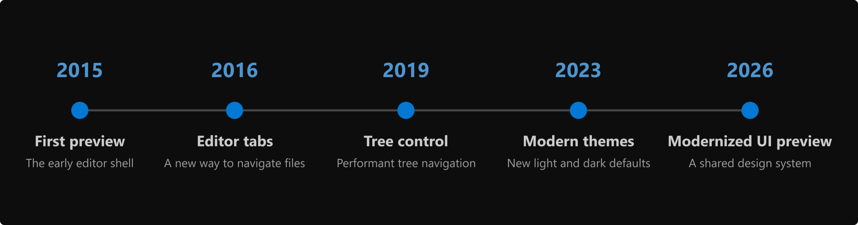
Timeline showing major VS Code interface milestones from 2015 to 2026.

The timeline highlights the first preview in 2015, editor tabs in 2016, the new tree widget in 2019, the Dark Modern and Light Modern themes in 2023, and the modernized UI preview in 2026.

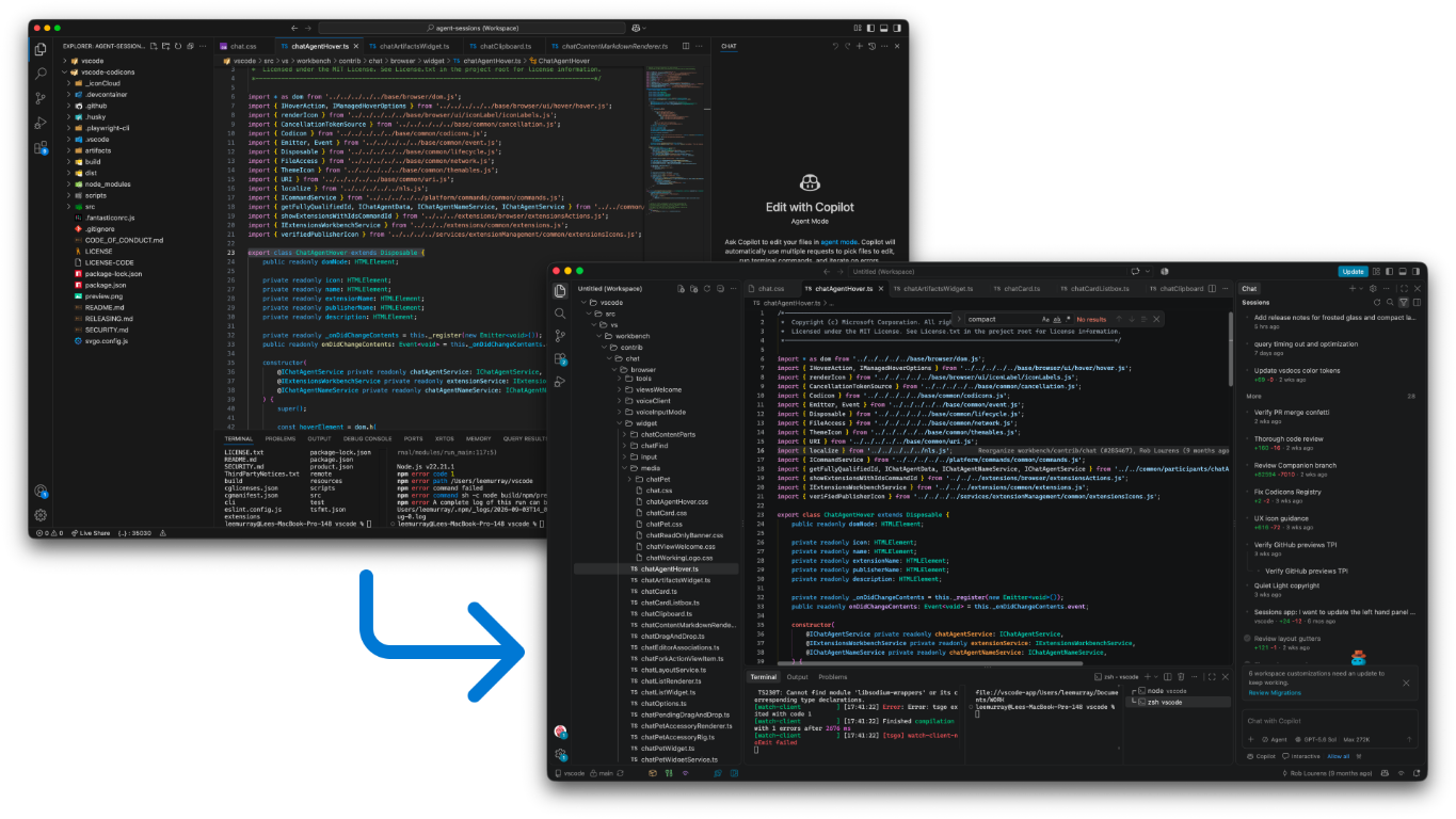
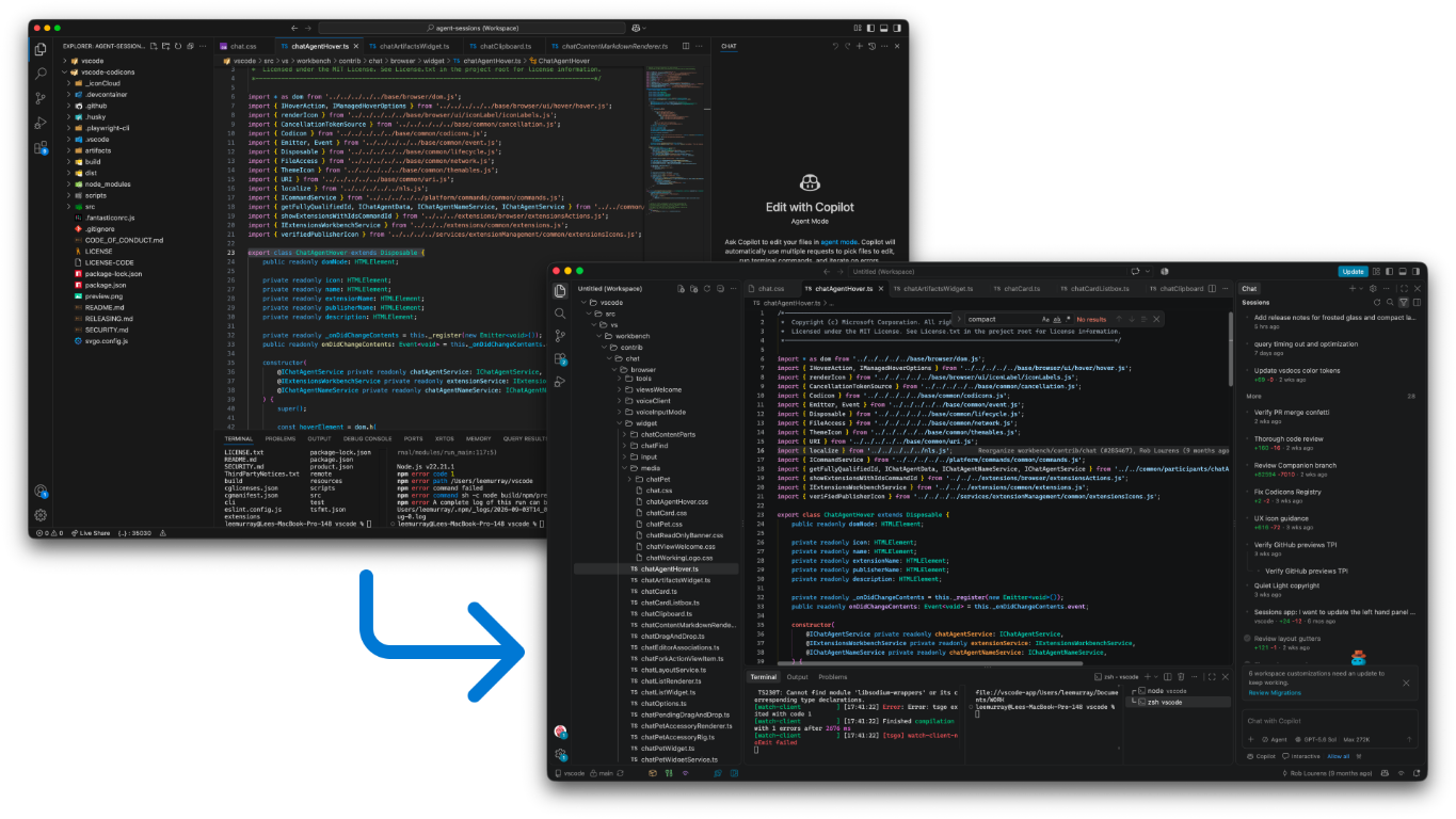
Screenshot showing overlapping VS Code windows with the classic and modernized interfaces, connected by an arrow.

The previous workbench design, which we refer to as the classic UI, and the modernized UI preview.

We continued refining each feature after it was introduced, guided by feedback across different themes, layouts, and workflows. The current modernization follows the same approach.

The first step: color

Color is part of how you make VS Code your own, but it also shapes how quickly you can read the interface. A balanced palette helps important content and states stand out without making every part of the workbench compete for attention.

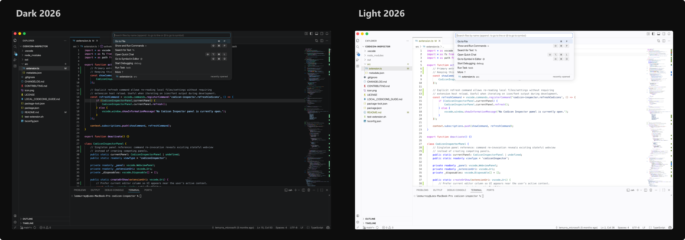
We began the modernization journey by rethinking color with the Dark 2026 and Light 2026 themes. We looked at workbench colors and syntax highlighting as one experience, establishing a visual foundation that we later carried into the modernized UI. A tighter range of surface colors creates a clearer hierarchy and keeps code at the center. More consistent hover, focus, selection, validation, and agent states help the interface read clearly in both light and dark environments.

Screenshot showing overlapping VS Code windows using the Dark 2026 and Light 2026 themes.

Dark 2026 and Light 2026 themes.

Color gave us a starting point, but creating a more cohesive interface required shared rules for spacing, typography, surfaces, and controls. The opportunity to develop those rules came with a new kind of VS Code window.

One VS Code, different ways of working

The Agents window became available in Stable as a Preview earlier in 2026. It brings the full agent workflow into one place, from starting sessions and following progress to reviewing results. It represents a new way of working in VS Code, centered on delegating tasks and reviewing work as it progresses. Supporting that shift called for a fresh approach to the interface, so session state and next actions remain easy to scan without crowding the prompt and review areas.

We’re aligning the Agents and editor windows around the same approach to typography, spacing, colors, tabs, and controls. Moving between them should feel like changing how you’re working, not switching to a different product. That doesn’t mean making the layouts identical or making everyone’s VS Code look the same. Each window remains optimized for its purpose, and you can still choose a theme, adjust density, and arrange your workspace to suit your screen and workflow.

The existing workbench was designed around direct interaction with files and had evolved component by component. Spacing, typography, surfaces, and controls didn’t always follow a shared system, which made it harder to adapt the interface to this new workflow or carry improvements across windows. The Agents window gave us a place to develop that shared design system.

We worked through those design decisions together and tested how they supported managing sessions, following progress, and reviewing changes. The result was a shared visual language we could refine across VS Code, not a separate identity for the Agents window.

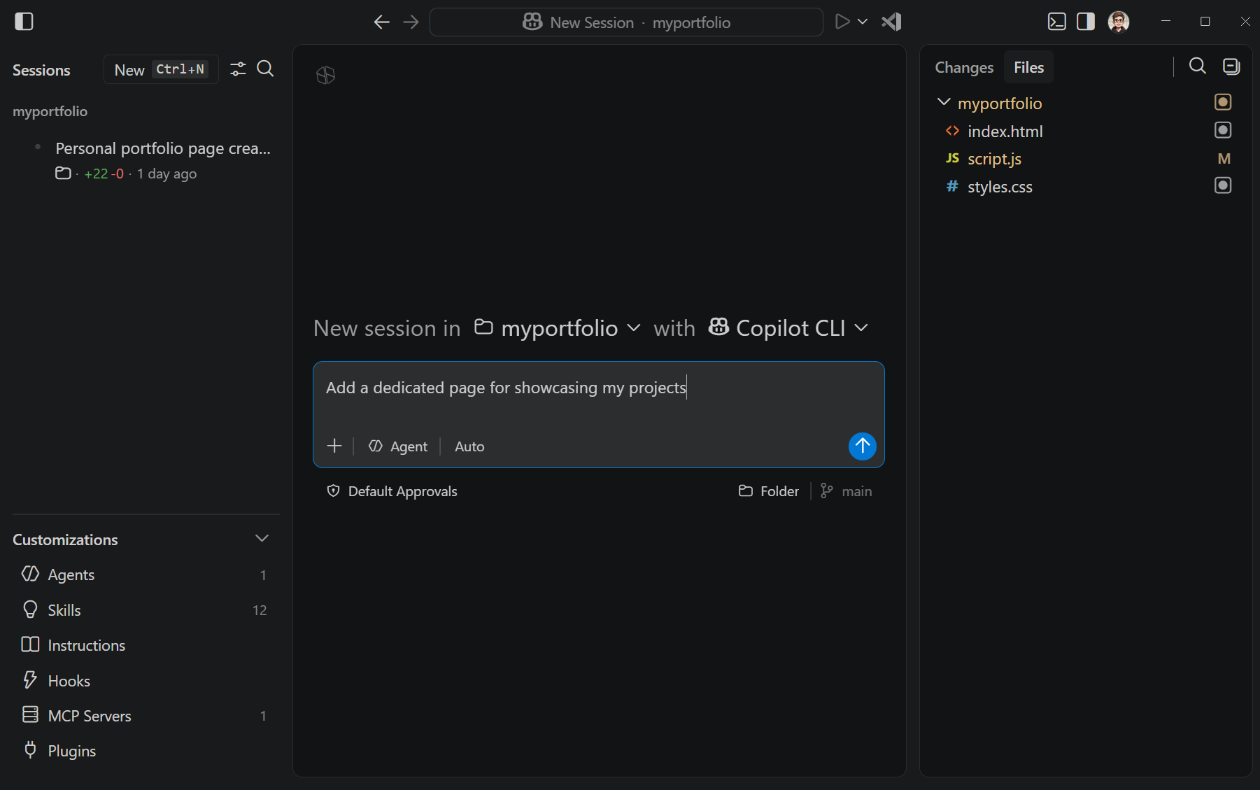
The Agents window showing the Sessions and Customizations sidebar, new-session composer, and Files panel.

The Agents window organizes the interface around agent sessions and reviewing their work. The screenshot shows an early implementation of the updated design system.

Once those decisions worked together in the Agents window, the next question was whether the same system could support the editor. The editor brings different demands, including dense file navigation, multiple editor groups, and long-established workflows.

Bringing the shared system into that environment became the next phase of the modernization. Rather than redesigning file editing itself, we started with the shared workbench shell: the foundational areas and controls people see and use across workflows. These elements define how the interface is organized and how people move through it. Starting there let us improve consistency while preserving dense navigation, multiple editor groups, and long-established patterns.

As the workbench had grown, related parts such as the Activity Bar, side bars, editor groups, panel, tabs, and status bar had developed different approaches to common design problems. The initial work focused on:

  • Separating major areas of the workbench clearly without making them feel disconnected.
  • Making controls for resizing and moving panels easier to discover.
  • Simplifying typography and visual hierarchy so your work remains the focus.
  • Using a consistent approach to spacing, corner radii, colors, and elevation.
  • Refreshing tabs while preserving customization.

Shared design tokens provide named values for spacing, sizes, and colors instead of defining them separately in every component. This lets us adjust the interface consistently and support different densities and themes.

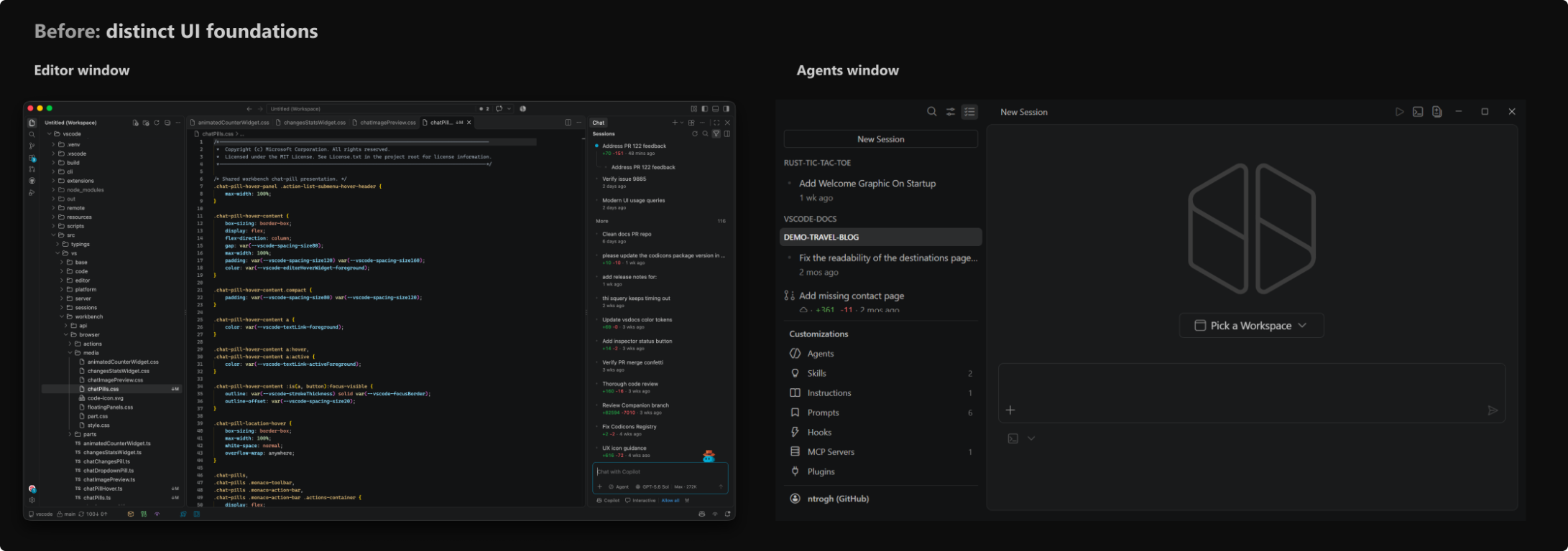
An earlier editor window and Agents window shown side by side, each based on its own UI foundation.

Earlier: the editor and Agents experiences began with layouts shaped independently around their workflows. Both windows use Dark 2026.

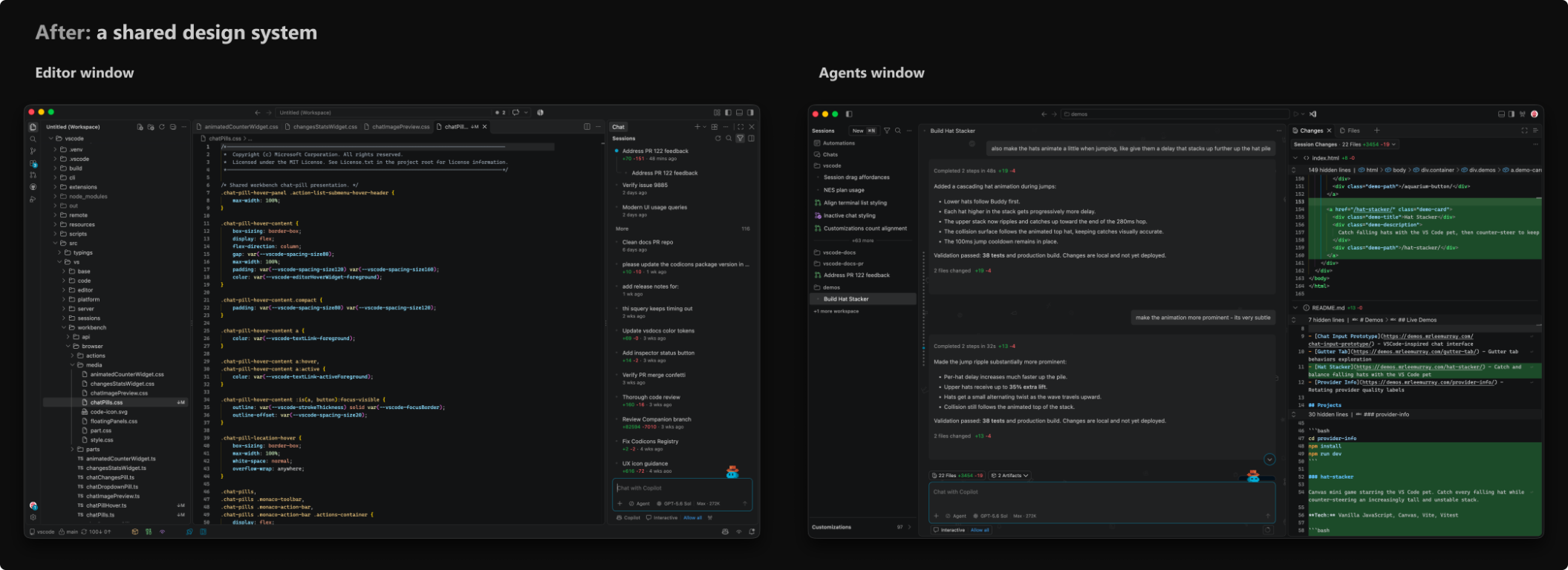
The modern editor window and Agents window shown side by side with consistent spacing, surfaces, typography, and controls.

Now: a shared design system creates a stronger family resemblance while each window remains optimized for its purpose. Both windows use Dark 2026.

Rolling out and learning from feedback

We introduced the modernized UI gradually so we could learn from increasingly broad groups of developers before making it the default. It first appeared as an experimental setting in Stable and was enabled by default in Insiders. We then ran a controlled experiment in Stable for a subset of users. After learning from that rollout, we enabled it by default while keeping the option to return to the classic UI during the transition.

As the preview reached more people, our design assumptions met the realities of different displays, zoom levels, themes, and workflows. We opened a public feedback discussion, and developers shared dozens of detailed examples. We combined that feedback with individual issue reports and team self-hosting to identify patterns rather than treating any screenshot or preference as universal.

Several common themes emerged:

  • Overall density: Gaps and panel padding left less room for code, tree rows, and terminal output, particularly on smaller displays and layouts with several editor groups.
  • Editor tabs: The pill design made the active file feel detached from its editor, while tab labels and actions competed for limited horizontal space.
  • Status bar: Wider item spacing reduced how much information fit before items were hidden.
  • Panel boundaries: Separators and resize controls needed to be easy to find without becoming visually distracting.
  • Theming and contrast: Theme users and authors needed more control over new surfaces, borders, and active states.
  • Responsiveness: Some reports called out rendering performance as the workbench updated.

On a 1920 x 1080 display at 100% zoom, the modernized UI currently uses approximately 20 px more horizontal space and 12-18 px more vertical space, depending on layout. We added space to separate content and make controls easier to find, but that also leaves less room for your work. Your feedback highlighted the importance of offering a better balance for different layouts.

How your feedback changed the design

Layout density

You told us that a more spacious interface wasn’t an improvement if it meant seeing less of your code or project. That feedback led us to implement Layout Density.

Compact density reduces spacing while keeping the structure and customization of the modernized UI. It’s designed for smaller displays, information-dense workflows, and anyone who prefers a tighter layout.

Combined with theme and color customization, it can give you a layout closer to the previous interface while keeping the new foundation.

To use compact density, open Customize Layout from the title bar and select Layout Density > Compact, or set window.density.layout to compact.

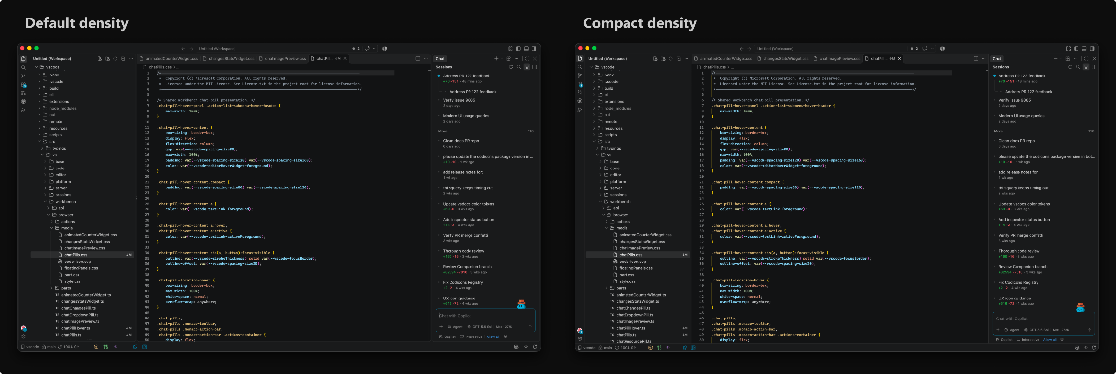
Screenshot showing the same VS Code workspace side by side at default and compact layout density.

Default density and compact density, shown with the same window size, theme, open views, and editor content.

Redesigned editor tabs

More recently, feedback about editor tabs prompted us to revisit their design. You use tabs to navigate files and see which content is active, so their relationship to the editor matters.

The initial pill-shaped tabs appeared as separate controls above the editor. That made the selected file harder to connect visually with its content, especially in themes with subtle active-state colors. With connected tabs, the selected tab joins the editor surface below it. The tab and its content appear as one continuous area, restoring a familiar cue for the active file.

Pill tabs and connected tabs shown side by side with the same files, active tab, theme, and layout.

Pill tabs and connected tabs, captured from matching production component fixtures.

If you prefer the pill design, you can still select it using the workbench.experimental.modernUIEditorTabStyle setting.

Smaller workbench refinements

Feedback also led to smaller changes across the workbench:

  • Simplified typography and removed all-caps labels.
  • Refined spacing, corner radii, and colors for a more consistent hierarchy.
  • Adjusted panel separation and resize controls.
  • Provided more controls for editor tabs.
  • Revisited status bar spacing.
  • Expanded theme customization for modernized UI elements.

You don’t have to change any settings to use these refinements. The following optional settings provide more control:

  • workbench.experimental.modernUIUppercaseViewHeaders uses uppercase text for view headers, side bar titles, and panel tabs.
  • workbench.activityBar.compact uses a narrower Activity Bar size that frees up more horizontal space in the UI.
  • workbench.editor.tabActionReserveSpace controls whether tabs in the modernized UI always reserve space for action buttons. Turn it off to give clean inactive tabs more room.

Settings with experimental in their name can change or be removed as the design stabilizes. The other settings are supported customization controls, not required migration steps.

What the modernized UI means for theme authors

Color themes are one of the main ways developers make VS Code their own, supported by a vibrant community of theme authors. As we updated and expanded the built-in themes for the modernized UI, we also exposed the new color controls to extension authors.

Existing themes remain compatible with both the modernized UI and the classic UI. The new color IDs for the modernized UI fall back to established workbench colors, so themes that don’t define them keep their existing palette.

Theme authors can opt into the new IDs for finer control over surfaces, borders, tabs, the Activity Bar, and window states. The IDs are experimental, so test any overrides in both the modernized and classic interfaces, and across light, dark, and high-contrast themes.

The theming guide for the modernized UI documents the complete token list, defaults, precedence rules, high-contrast behavior, and examples. The existing Color Theme guide explains how to package and publish a theme extension.

Keeping the modernized UI responsive

Visual consistency can’t come at the cost of responsiveness. Some feedback reports called out rendering performance, so we investigated with browser traces and repeatable benchmarks.

When the UI changes, the browser recalculates which styles apply. Broad CSS selectors can make that work more expensive than necessary. In the first set of selector fixes, we replaced selectors that inspected large parts of the DOM with state classes that components already knew, such as whether the diff overview or a debug action was present.

We measured those changes with a repeatable sequence of common workbench interactions: resizing, switching views, scrolling, opening diffs, and running widget animations. The fixes reduced style-recalculation time by 8.2% and wall-clock time by 3.3% in that combined benchmark. Layout time increased by 6.6%, so the result recovered some of the difference from the previous interface, but not all of it.

These are targeted improvements rather than a claim that the whole workbench became faster. To prevent the same patterns from returning, lint rules reject known expensive selectors, and npm run perf:css gives us a repeatable benchmark for future changes.

Where we go from here

The modernization is still evolving. Today, you can choose between the updated interface and the previous VS Code workbench design, which we refer to as the classic UI. Over time, we plan to retire the classic UI so we can focus improvements on a shared foundation.

During the transition, you can return to the classic UI by opening Settings, searching for workbench.experimental.modernUI, and clearing the checkbox. This option is temporary, although we haven’t set a date for removing it. We’ll share the timeline and give you advance notice before the transition ends.

Before then, we’ll continue to:

  • Align shared controls and styling across the Agents and editor windows while preserving what each workflow needs.
  • Continue refining Dark 2026 and Light 2026 through feedback on contrast, readability, and syntax colors.
  • Refine tab styling and customization.
  • Profile rendering costs and validate further improvements with repeatable workbench measurements.
  • Adjust density, layout controls, and other details in response to specific feedback.
  • Make Layout Density and related customization easier to discover.

Thank you for helping us improve the design. The larger updates and smaller refinements across the workbench reflect what we’ve learned from you. Please keep sharing what works and what gets in your way. You don’t need design terminology or a proposed fix. A screenshot and details about your display, zoom level, theme, settings, and workflow help us understand the problem. If you return to the classic UI, tell us what the updated interface needs to improve before it becomes the only interface.

Share feedback or report an issue

Happy coding! 💙

AutoCAD Crashed? Here’s Exactly What To Do Next


Hey All,

I still vividly remember a specific project, we were in a tight crunch and just a day from the submission date, 25+ sheets of detailed design drawings, trying to make the final edits and add the last specs and notes at the end of the day before final checks and plotting…

Then it happened, No warning. No freeze. Just gone. AutoCAD Crashed…

Sure we had backups and had saved somewhat recently, but we had still just lost at least an hour of work…

At that moment, I questioned everything…
Why didn’t I have autosave set to a shorter interval? (I had increased it since the network had been causing lags and slow save times each autosave.
Where was the .bak file?
When did I last manually save?
What did I just lose and how can I make these updates that took over an hour before my reviewer leaves for the day!?

We’ve all been there, whether it’s your first crash or your fiftieth.
The good news? These days, recovering from an AutoCAD crash is much easier (if you know what to do).

Which brings us to this week’s featured tip, video, and tools…


Quick Tip: Never Lose Hours of Work Again

Command: DRAWINGRECOVERY
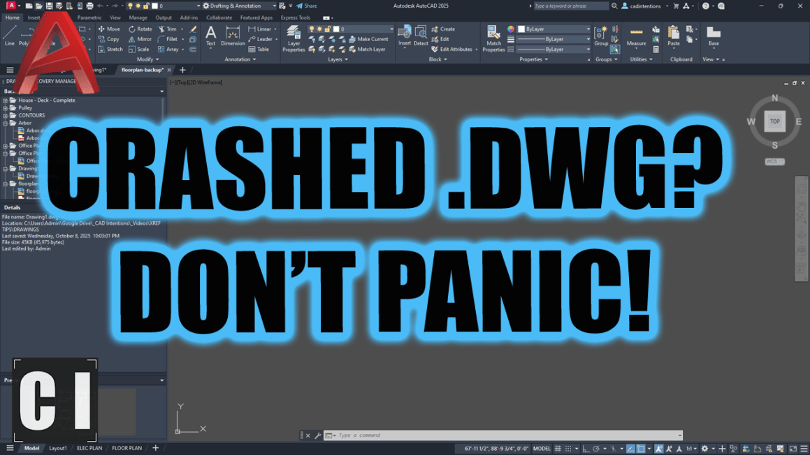
When AutoCAD crashes and reopens, you’ll often see the Drawing Recovery Manager pop up.

But if it doesn’t, just type DRAWINGRECOVERY to open it manually.

Here, you can find autosaved versions (.sv$), backups (.bak), or even previous sessions that you didn’t know AutoCAD saved.

Bonus:

  • Search your autosave folder here:
    C:\Users\YourName\AppData\Local\Temp\

Featured Video: STOP Losing Work! AutoCAD Crash Recovery Guide

You asked for it, and this one’s a must-watch.

In this video, I walk through step-by-step:

  • How to recover a crashed drawing (.sv$, .bak, and DWG)
  • How to find autosave folders manually
  • How to fix corrupted drawings (with AUDIT, RECOVER, PURGE, OVERKILL)
  • How to prevent future crashes with the right autosave and graphics settings

It’s the crash checklist I wish I had years ago.

Watch it here →
👉 STOP Losing Work! AutoCAD Crash Recovery Guide

Save this free cheatsheet to save time and work:


Tool of the Week: Plex-Earth

If you work with civil, site, or infrastructure design you probably already know about long time supporter of the channel, Plex-Earth. It might just become your new best friend.

✅ Import high-res satellite imagery directly into AutoCAD
✅ Generate terrain surfaces from Google Earth, Bing Maps, and more
✅ Add GIS data layers and 3D maps without leaving CAD

Whether you’re planning a site or pitching a concept, Plex-Earth helps bring the real world into your drawings fast.

🔗 Try Plex-Earth → http://cadintentions.com/plexearth


If you’re enjoying these tips and want to go deeper, check out my AutoCAD Fundamentals & Workflows course. It’s packed with the real-world systems I use every day: templates, plotting, layout workflows, title blocks, and more.


That’s it for this week!
Let me know some of your Drawing recovery tips/tricks in the comments or by hitting reply!

Cheers and happy drafting,
Brandon

P.S. If you’ve got a colleague who always fighting with CAD crashes or forgetting to save their work regularly, forward this email or send them a link!

They’ll thank you later.

The following two tabs change content below.

Brandon is a Civil Designer, Aspiring Blogger/Creator, Husband, Father to two Amazing Kids and Tech Aficionado from a small town in Canada. He has been obsessed with design and technology since he can remember and working as a Civil Designer for nearly as long. Brandon’s blog and Youtube channel, CADIntentions.com has been his outlet and excuse for keeping up with new tech and trends in the CAD design world for the last 10 years growing to more than 60,000 subscribers and over 15,000,000 views, while also being the source of many great friendships and unique opportunities.

If you would like to Sponsor CAD Intentions or Work together in some way, Please visit my About Page and send me an email: http://cadintentions.com/about-me/


Think You’ve Beaten Fountains? Prove it in the Gauntlet


Summary

  • Gauntlet mode arrives in Fountains.
  • Tips and tricks to survive the ultimate challenge.
  • Fountains and other Crunching Koalas titles on sale today.

So, what exactly is the Gauntlet Mode? Think of it as the ultimate proving ground for warriors who crave a real challenge. Originally designed on PC to accommodate the most demanding souls-like connoisseurs, it’s now arriving on XBOX just after the console version’s premiere.

It’s your turn to test your mettle!

Built for the most demanding players, the Gauntlet gives you something to sink your teeth into after the credits roll. It’s a place to push your skills to the limit, and emerge victorious… or not at all.

A bit confused about what Fountains is like? This gameplay trailer should clear things up.

Entering the Gauntlet

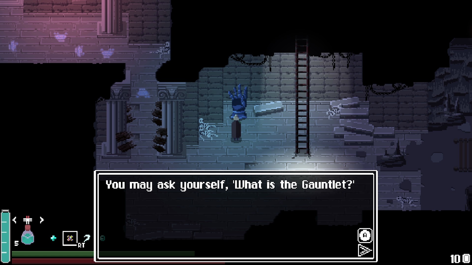
Along the main story, a new character appears: a very literal one. The NPC who runs the show looks exactly like a medieval gauntlet protecting a noble knight’s hand in combat. However, first you’ll need to prove you’re worthy of entrance. After defeating the final boss, have a chat with the gauntlet keeper and the challenge begins.

FOUNTAINS screenshot

The Run

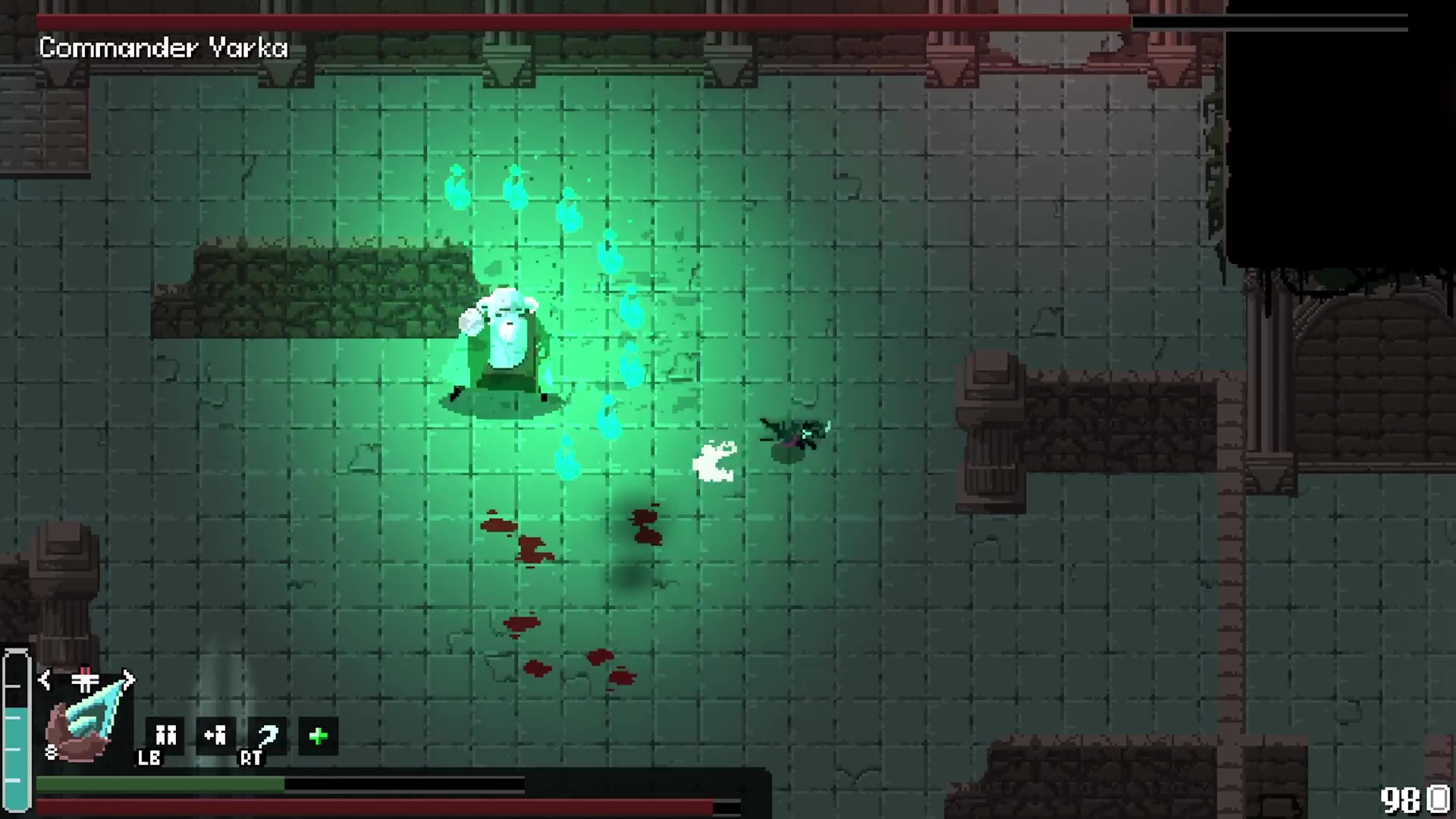
Here’s the deal. Fountains has ten boss fights, and the Gauntlet throws every single one of them at you back-to-back. If you own the Shattered Shape expansion, you’ll be able to choose that variant of the Gauntlet and face those bosses too. Each boss stalks their own arena, and every victory teleports you straight to the next showdown.

You’re not walking into this unprepared, though. Bring in your equipment and stock up on consumables. After your third fight, you’ll land in a rest area. Recharge your healing flasks, swap your gear and take a breath before the next round. The same safe haven awaits after the sixth fight, and again after the ninth. Then comes the tenth and final fight – the final boss of the game.

And since every consumable you use during a run is returned to you when it ends, you can spend them without a second thought.

FOUNTAINS screenshot

Tips & Tricks

A few tips from the team before you dive in.

Treat every run like a lab. The Gauntlet is a trial you can repeat as often as you like, so use that freedom. Test strange builds, try bold strategies and learn what works.

Pack more than one loadout. Every boss has its own tricks, and the build that melts one might crumble against another. Bring a few sets and switch them up at the rest areas.

Spend your consumables, but spend them smart. They return after the run, but that doesn’t make them infinite during it. Don’t hoard them for a “later” that might never come. Use them boldly and make every one count.

FOUNTAINS screenshot

That’s the Gauntlet! Keep a cool head, keep trying and don’t let a defeat shake you. Only the best will pass the test.

Haven’t picked up the game yet? There’s never been a better time. Fountains: Extended Edition (containing the base game and the DLC) is now 20% off, so you can jump in and take on the challenge yourself!

On the Go? We’ve Got You.

Love gaming wherever you are? Other XBOX Play Anywhere compatible titles from Crunching Koalas are on sale too, all with a -50% discount!

Heading Out – Hit the highway in a genre-bending road trip adventure that fuses high-speed racing with narrative storytelling. Outrun your fears across a mythic America, balancing roguelike routes and limited resources, all set to a jazz-and-rock Americana soundtrack and a comic-inspired art style.

Kamikaze Lassplanes– A visual novel and an arcade shoot-’em-up in one. Meet Alba and Hannah, charismatic Lassplanes who transform into deadly war planes you pilot. Your story-branching choices decide the fate of the war, and of your heart.

Once Upon a Jester – A musical comedy adventure starring best friends Sok and Jester, who plot to steal the Royal Diamond by becoming the kingdom’s best improv theatre act. Perform improvised shows, befriend a cast of wacky, fully voiced characters and sing your heart out to an original indie soundtrack.


Want to give Gauntlet mode a try yourself? The Gauntlet update is live now in Fountains!

FOUNTAINS: Extended Edition

Crunching Koalas


☆☆☆☆☆
11


★★★★★


$19.99


The Fountain of Youth is unearthed – but the One Kingdom hides far more than one secret. Face brutal, precise soulslike combat across a sprawling, interconnected world, then descend into the forsaken Vainlands with Shattered Shape, where new foes, weapons, skills and a new land await.

This bundle contains everything you need to conquer the One Kingdom.

– Full soulslike action-RPG + Shattered Shape expansion
– A seamless, labyrinthine world – now even more sprawlin with the uncharted southern Vainlands
– New enemies, weapons, and armor to master alongside the base arsenal
– Uncover the entire truth of the Usurper’s Prophecy, start to finish

Ukraine Claims World’s First Drone Evacuation of Wounded Soldier


Ukraine says it carried out the world’s first evacuation of a wounded soldier by aerial drone, using a heavy-lift hexacopter after enemy drones and landmines made conventional ground evacuation too dangerous. NBC News reports: Shared by the 92nd Separate Assault Brigade on Monday, the video shows the soldier strapping himself into a large drone and being flown at what appears to be relatively low altitude over blurred-out territory. The drone carefully lowers him, and the drone operator greets him with “Welcome back to the ground!” The video also shows blurred faces of drone operators who carried out the mission.

The post said the unidentified infantryman was wounded at his position. “Due to intense enemy drone activity and the presence of landmines, evacuation using conventional unmanned ground vehicles was impossible,” the brigade said. “At that point, the specialists in our unit took it upon themselves to attempt something that had never been done before: evacuating a serviceman using an aerial drone,” it added.

The craft was a heavy-lift hexacopter, it said, originally designed as a bomber by a Ukrainian manufacturer. It looks about twice the size of the soldier in the video. The specialists working on the mission had to ensure the drone could carry a human being without flipping over or swaying excessively, according to the unit.

TikTok staff raised child safety concerns, but executives reportedly failed to act


TikTok was repeatedly warned by employees about the risks the social media platform posed to children, according to court records obtained NPR. The documents say employees were frustrated with how executives responded to their concerns about risks to children, including sexual exploitation and exposure to suicide-related content.

Depositions of employees filed in March 2026 are shedding new light on TikTok’s child safety practices.

According to NPR, TikTok employees warned that minors were appearing in sexual content that was available for purchase on TikTok, raising concerns that the company could profit from potentially illegal activity. They also flagged that minors were exploiting loopholes to access age-restricted content and hide their activity from parents.

Additionally, the court documents show that TikTok didn’t conduct surveys to determine the age of its users out of concern that it would have to share the results with the Federal Trade Commission.

TikTok, in addition to Meta, Google and Snap, faces hundreds of lawsuits consolidated in federal court. The lawsuits allege that these companies’ platforms harm minors, and that they failed to disclose known risks to young users.

TikTok has reached settlements in several of these cases before they went to trial, including one in Los Angeles where a jury found that Meta and YouTube had designed their platforms to be addictive to young users.

TikTok did not immediately respond to TechCrunch’s request for comment.