eGPUs Do Work, But They Come With Some Notable Limitations


Just buy a basic gaming PC instead.

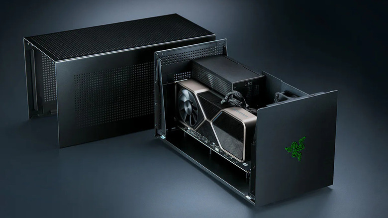
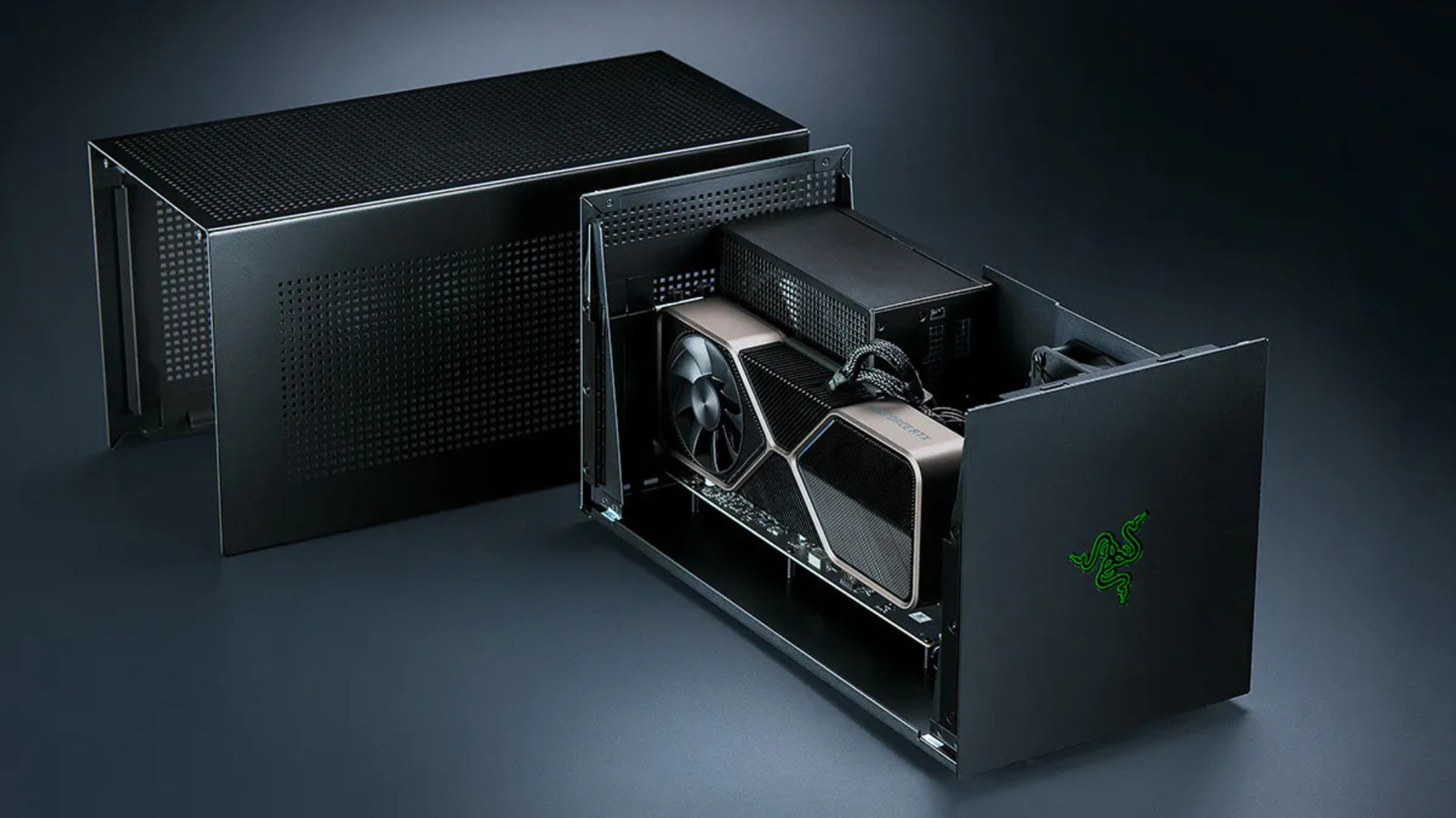
If you’ve been looking to get more gaming power out of your laptop but don’t want to pay for a replacement amid RAMpocalypse pricing, an eGPU could be your best bet. An eGPU is an external graphics processor, usually a desktop graphics card in an enclosure connected to a compatible laptop or gaming handheld through Thunderbolt or USB4. They can be pretty good at taking over rendering, meaning even thinner and weaker machines can run more demanding games with one plugged in, but there are many caveats.

A GPU run as an eGPU will typically operate slower over Thunderbolt than it would inside a desktop. The enclosure to house it costs hundreds of dollars too, and some devices, like Apple Silicon-based Macs, can’t use an eGPU for gaming at all. That said, eGPU hardware is in better shape today than it has been in years. Razer revived its eGPU line with a Thunderbolt 5 dock in July 2025, and Framework is building an eGPU kit for its Laptop 16.

How much performance is lost with an eGPU?

A Thunderbolt 4 port carries 40Gbps, and Intel’s spec allots PCIe data 32 Gbps of it, an eighth of the bandwidth a desktop PCIe 4.0 x16 slot provides. Most of what the card in an eGPU enclosure does will never cross the Thunderbolt cable. Textures and shaders get loaded into VRAM once and remain there, meaning the cable only gets busy when a game pulls in new assets or sends finished frames back to the display.

Portables review site Notebookcheck tested an RTX 2080 Ti enclosure back in 2021 and found deficits ranging from seven to 32 percent when compared to a desktop. Losses did shrink to single digits at 4K on an external monitor, but rendering to a laptop is slower because finished frames travel back down the same cable. In contrast, PC Gamer tested an RTX 4070 Ti and 4090 over Thunderbolt, OCuLink and desktop PCIe. Its RTX 4070 Ti ran around 25 percent slower over Thunderbolt than OCuLink in many 1440p tests, with lower 1 percent lows and more stuttering.

PC Gamer also claimed that upgrading from the 4070 Ti to the 4090 delivered smaller gains over Thunderbolt and OCuLink compared to desktop. So, the faster the card, the more of its performance the Thunderbolt cable restricts, making a mid-range GPU the more sensible choice for an eGPU enclosure. Thunderbolt 5 provides 80 Gbps of connection bandwidth, while Razer’s $350 Core X V2 connects the GPU through PCIe 4.0 x4, nominally 64 Gbps. That gives an x16 graphics card four lanes instead of the 16 available in a suitable desktop slot.

Cost and compatibility

The Core X V2 comes with only the enclosure; no power supply, USB ports or Ethernet. You’ll need to add your own ATX PSU, and Razer now sells the missing I/O separately as a Thunderbolt 5 dock starting at $390 for the Mercury version. Throw in the graphics card itself and there’s really little point in buying all these components when you could just invest in a budget gaming rig instead. At least in doing so, you’ll be avoiding the external connection’s bandwidth limit. Thunderbolt 5 laptops are also few and far between outside premium gaming machines and mobile workstations, so connecting the enclosure to a compatible Thunderbolt 4 laptop limits the connection to 40 Gbps regardless.

OCuLink does manage to get around Thunderbolt by running bare PCIe over a cable. That’s the route Framework is taking. Its OCuLink Dev Kit exposes an eight-lane PCIe connection on the Laptop 16, rated at up to 128 Gbps. You end up sacrificing some convenience here given that OCuLink doesn’t power the host, and there’s none of the plug-and-play that makes a Thunderbolt box a one-cable dock.

Apple dropped eGPU support with its move away from Intel silicon back in 2020. No macOS release since has brought it back for graphics acceleration. However, Apple did approve TinyGPU earlier this year, a driver extension from the tinygrad project that runs newer AMD and Nvidia cards over Thunderbolt or USB4. It’s for AI workloads only, and its lack of display output means it won’t get you anywhere for gaming use cases.

Magic: The Gathering’s next big crossover is with itself


Over the last three years, since the Wilds of Eldraine set, Magic: The Gathering’s core expansions have been building to a climactic storyline. It’s very comic book, a multiverse-threatening crossover that’s been set off by the planeswalker Jace Beleren trying to create a new multiverse, one that’s free of all the threats Magic’s setting has faced in recent years—Phyrexians, Eldrazi, etcetera—but which will overwrite the existing multiverse once it’s complete.

This sets up a bunch of mirror matches where famous planeswalkers face off against their doppelgangers: the pyromantic Chandra versus a cryomantic version of herself while none-more-goth necromancer Liliana is up against a version of herself who practices life magic and, horrifyingly, wears white.

“Nearly everyone” laid off at Hyper Light Drifter devs Heart Machine after publisher drops unannounced game


Heart Machine, the US-based makers of Hyper Light Drifter, its multiplayer spinoff Hyper Light Breaker, and last year’s Possessor(s), have laid off “nearly everyone” on staff after an unnamed publisher pulled funding for their next, unannounced game.

Continue reading ““Nearly everyone” laid off at Hyper Light Drifter devs Heart Machine after publisher drops unannounced game”

Building the new GitHub Copilot Inline Suggestions Model: Part One


September 16, 2026 by Julia Gong, Ben Liggett, and Ulugbek Abdullaev

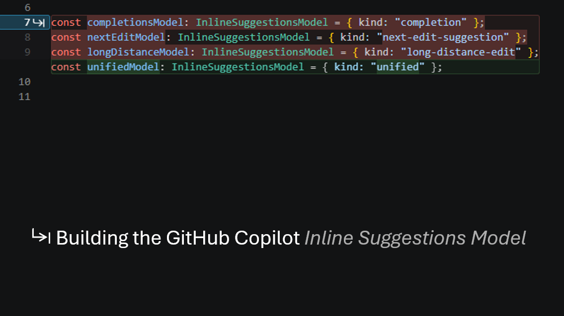
Completion-style ghost text, next edit suggestions near the cursor, and edits farther away were previously powered by separate models. We built one model for all three, and learned that the best results come from training, evaluation, and editor design evolving together.

At GitHub Copilot, our mission is to support all development workflows, from AI-assisted coding using inline suggestions to agent-first software engineering in the VS Code Agents window. Inline suggestions are used and loved by millions of developers, and we continue to push the quality bar on it and all GitHub Copilot experiences.

Writing code is rarely linear. The next useful change might be a few characters at the cursor, a nearby rewrite, or a related edit elsewhere in the codebase. Inline suggestions accommodate these different workflows through completion-style ghost text, nearby next edit suggestions, and long-distance edits.

Previously, specialized model paths powered each type of suggestion. The tried-and-true completions model doesn’t need much of an introduction, and in earlier posts, we shared how we trained a custom model for next edit suggestions and extended those suggestions to edits farther away. We have now unified all three models behind a single “3-in-1” model that can do it all.

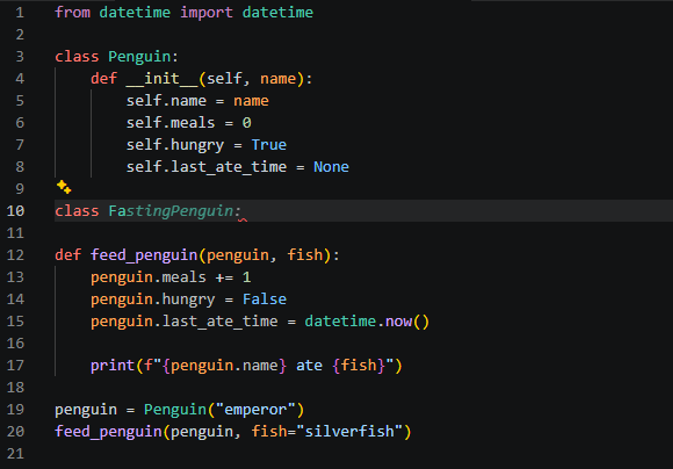
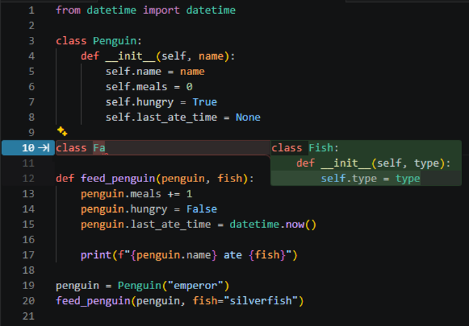
Unifying the models improves suggestion quality by allowing a single model to choose the best edit for the developer’s current work end-to-end instead of using programmatic logic to choose among specialized models. For instance, let’s say the developer has typed class Fa in the penguin feeding program below. Using the previous standalone models (left), the most mature and battle-tested completions model is always triggered first. Since it can only append to the prefix Fa, it does what it knows best and suggests FastingPenguin. However, in this particular case, a better NES suggestion exists, as suggested by the unified model (right): semantically rewrite Fa to Fish.

Before (standalone models) After (unified model)
A code example where the standalone completion model chooses FastingPenguin instead of the better Fish rewrite. A code example where the unified model selects the better Fish rewrite for the same context.

Not only can we tackle all existing tasks in one model, but because this model can output multiple edits in one response, we can cache these additional edits to deliver a faster experience for subsequent edits if the preceding suggestions were desirable. This creates a smoother, snappier tab-tab-tab experience across the editing flow.

To enable this better editing experience, we first reframed the modeling task—especially the prompt and output format—to generalize across code editing tasks. We then combined our learnings in data quality, model training and evaluation, and client design from the standalone models, in addition to extensive additional experimentation (over 200 offline and 20 online experiments, whose course we will chart in the remainder of these posts), to carefully optimize the model and end-to-end experience. The result is a higher quality, faster, and more cohesive typing companion that is greater than the sum of its parts.
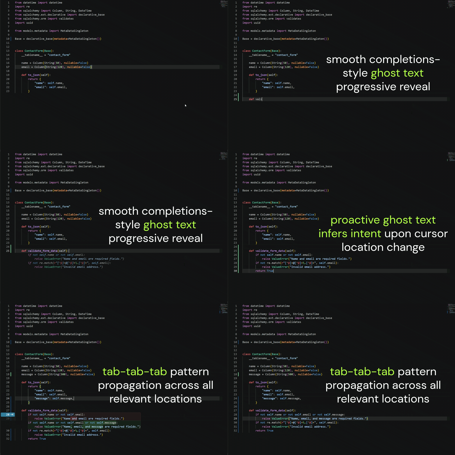
An animation of a VS Code coding experience with ghost text and fast follow-up tab-tab-tab suggestions showing the unified inline suggestions experience.

Why unify?

Prior to the unified model, the production implementation of inline suggestions in VS Code was powered by three separate models:

  1. Completions (the familiar ghost text we all know and love),
  2. NES (next edit suggestions, or nearby edits bounded by a few lines above and below the cursor position),
  3. Long-distance NES (longer-range NES-style suggestions farther from the cursor).

This dedicated work on individual tasks, with a highly mature completions model alongside newer editing models, resulted in a client-orchestrated experience that triggered each where appropriate.

While effective for these individual tasks and a necessary step to bring new editing capabilities to users, this created key shortcomings not only in terms of user flow quality (sometimes making suboptimal or piecemeal edits rather than a single clear edit that best serves the context) and latency (potentially up to 4 model calls per opportunity, as shown in the figure below), but also in terms of extensibility to future features (for example, multi-file edits).
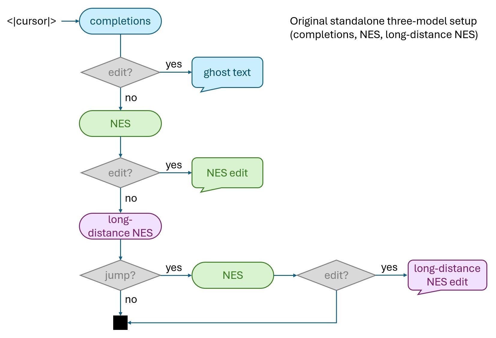
Standalone models diagram showing separate completion, NES, and long-distance NES call paths.

Figure 1. The original stepping-stone production setup for VS Code inline suggestions with three standalone models: completions, NES, and long-distance NES. Note that this diagram is simplified for clarity and represents the behavior from a user’s perspective (real provider calling behavior is more complex and involves issuing parallel calls to completions and NES, for instance, depending on the position of the user’s cursor and how quickly the prioritized model responds). Each model handled its own standalone task, while the client orchestrated the logic of when to trigger which model. The completions model would always be triggered first to predict ghost text at the user’s cursor, which would be shown if ghost text was generated. If no ghost text was produced, the NES model would be invoked to rewrite the window around the user’s cursor, and shown using the appropriately rendered view kind if the rewrite resulted in a net edit. If still no edit was predicted, the long-distance edit model was triggered to predict a potential line number to jump to. If no line number was produced, no edit would be shown. If it did jump to a new line number, the NES model would be invoked once more to rewrite a window around the long-distance line number, resulting in a long-distance NES edit.

Unification also creates a compounding benefit. With one shared model powering every inline suggestion, each model improvement or new model feature can now benefit the full experience rather than remaining isolated to a single suggestion type.

Reformulating the code editing task

Knowing that a unified model was the north star, we realized this was an opportunity to reformulate the code editing problem, starting from the model output format. None of the three individual siloed tasks of predicting a suffix (completions), a window rewrite (NES), or a line number (cursor jump), which we had solved systematically and individually over time, were sufficiently expressive to represent the other tasks entirely. To combine these into a single model that could do all three, we needed a similarly unified output format—this gave rise to an elegant solution that we call the “diff patch” output format.

Consider a developer changing a function signature. The next useful action may be completing a new argument at the cursor. A moment later, it may be updating a call site below. After that, it may be adjusting validation logic elsewhere in the file. These are different interactions, but they are part of one editing task. A shared patch language lets the model reason about them as sequential steps of the same problem, which can be presented to the user with greater fluidity.

To fully understand the model output format changes, one can think of the three individual model tasks each as natural extensions of LLM next-token prediction capabilities—completions continued unfinished code, NES rewrote a local edit window, and long-distance edits predicted the next line number to jump to, accompanied by a call to NES. The 3-in-1 model puts these together to tackle all three at once while allowing the model to predict multiple edits in one pass.

To make this concrete, consider this example, where the symbol <|cursor|> represents the position of the user’s cursor.

def feed_penguin(penguin, fo<|cursor|>):
    penguin.meals += 1
    penguin.hungry = False
    penguin.last_ate_time = datetime.now()

    print(f"{penguin.name} ate {fish.type}")

penguin = Penguin("emperor")
feed_penguin(penguin, fish="silverfish")

The completions, NES, and long-distance edit models might predict the following in isolation to make the best edit for their corresponding tasks:

Completions format NES (Window Rewrite) format Long-Distance Edit format
od
def feed_penguin(penguin, food):
    penguin.meals += 1
    penguin.hungry = False
    penguin.last_ate_time = datetime.now()

    print(f"{penguin.name} ate {food.type}")
5 (the next line number where fish should be replaced with food)

The diff patch output format puts all of these elements together into a chain of edits that makes most sense at the cursor, farther away from the cursor, and even in a related file:

/path/to/penguins.py:0
-def feed_penguin(penguin, fish):
+def feed_penguin(penguin, food):
/path/to/penguins.py:5
-    print(f"{penguin.name} ate {fish.type}")
+    print(f"{penguin.name} ate {food.type}")
/path/to/penguins.py:8
-feed_penguin(penguin, fish="silverfish")
+feed_penguin(penguin, food="silverfish")
/path/to/antarctica.py:42
-feed_penguin(penguin2, fish="krill")
+feed_penguin(penguin2, food="krill")

Multi-patch responses also importantly allow us to cache subsequent patches (in the example above, the edits at lines 5, 8, and 42). Upon acceptance of preceding patches, they can appear with low latency, which results in a fast tab-tab-tab code editing experience.

This format expresses the three previous tasks in full and allows for flexibility in elegantly expressing future behaviors like cross-file edits (edits suggested in a related, but different file from the current one). More general formats such as tool calls are more abundant in pretraining and support actions beyond editing, but for code edits, we found that this format is most compact while remaining expressive.

In addition to reformulating the output task, we also took the opportunity to revisit the context given to the model as input. Originally, the input to the model included:

  1. Recently viewed code snippets without line numbers
  2. Current file content with line numbers
  3. Recent edit history of the user in unified diff format
  4. Area around the code to edit, a total of +/- 15 lines around the user’s cursor to pad the code to edit region
  5. Code to edit, the rewrite window spanning 2 lines above and 5 lines below the user’s cursor

The unified output format enabled us to simplify the input context as well. Because the task scope now allowed for arbitrary edits anywhere in the file and was not limited to predicting the suffix at a specific location or rewriting a fixed window, we could remove the last two sections of the input—area around the code to edit and code to edit—and instead replace it with a single 3-line block with the line number and file content of the current cursor location. One important learning we carried forward from the previous models was that since the user’s cursor is constantly changing positions, we kept the cursor location section at the end of the prompt as opposed to directly placing it inside of the current file content. This optimizes key-value caching by maximizing the common prefix of the prompt with previous prompts.

We wanted to tackle the problem of unification methodically, so we approached it in two phases. First, we unified the NES and long-distance capabilities into a single model with the unified diff patch format, which we refer to as the 2-in-1 model. The completions model was left intact, and the client orchestration logic was simplified to prioritize completions, followed by the 2-in-1 model. We then unified the 2-in-1 model with the completions model to bring in the ghost text capabilities to arrive at the 3-in-1 model. We’ll describe our experimental process and share some of the methods we developed, challenges we encountered, and learnings we gained along the way.
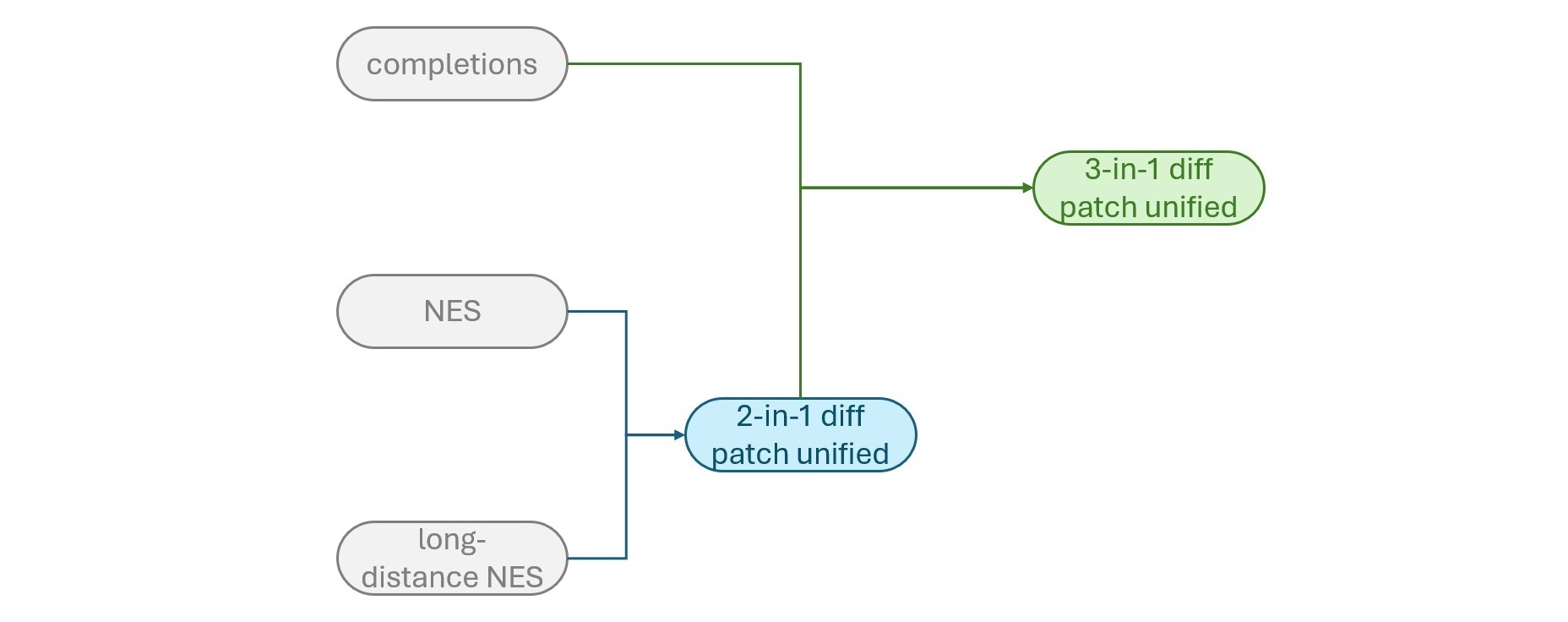
The unification strategy diagram showing the stagewise merge from completions, NES, and long-distance edit models into the 2-in-1 model and then the final 3-in-1 model.

Figure 2. We first unified the NES and long-distance NES models to yield the 2-in-1 unified model, followed by unifying the 2-in-1 model with the completions model to yield the 3-in-1 model.

Phase 1: The 2-in-1 model

We deliberately chose to first tackle NES and long-distance edits before completions. In our experience, the completions model accounted for most of the inline suggestions traffic—higher than 70% of edit opportunities. Previous experimentation from the team also showed that NES suggestions were more prone to user dismissals than ghost text. Thus, we chose to first unify the two other models and tackle the flagship completions model last. Because the diff patch output format could be used for the 2-in-1 model, this also meant that later training for the 3-in-1 model could directly take advantage of the data and other learnings from the 2-in-1 model, accelerating experiment velocity.

Evaluation

To build a good system and improve it, we must start by deciding what we want to measure. No single score captures the quality of an inline suggestions model. We therefore used four complementary stages of evaluation, similar to the process we used for earlier next edit suggestion releases.

  1. Offline evaluation: Targeted offline tests helped us inspect completion behavior, difficult editing scenarios, patch validity, suggestion length, and the balance among different types of edits.
  2. Internal dogfooding: Daily use exposed issues that aggregate scores could miss, such as suggestions that were reasonable but poorly timed, too eager, incomplete, or awkwardly presented.
  3. Human evaluation at scale: We also did human evaluation with programmers of diverse backgrounds on thousands of coding tasks using structured feedback templates to get a quantitative assessment of model quality from real developers.
  4. Controlled online experiments: Promising model candidates were flighted live using A/B testing so we could evaluate the ultimate impact of the model on real users.

Each stage answered a different question. Offline evaluation told us whether a candidate was worth testing. Dogfooding gave us a firsthand perspective on how it felt in realistic workflows. Human evaluation quantified the dogfooding experience and provided structured feedback. Online experiments told us whether the complete system created value in use compared to the existing production setup.

Offline benchmarks

Offline evaluation for the original NES models consisted primarily of 3 benchmarks, which each assessed different dimensions of the NES models:

  1. Simulation Tests (STests). A manually curated set of workspace recordings from our team that demonstrate must-have, nice-to-have, and must-avoid suggestion behaviors.
  2. HumanEval. An augmented version of the HumanEval dataset from OpenAI that was expanded to evaluate models’ completion capabilities on single-line, multi-line, and random spans of code.
  3. Output View Kind. Examples passed through prior production models, including the view kinds (ghost text, side-by-side NES, no edit, etc.) of the models’ output, used to track any differences in the distribution of view kinds produced by new candidates compared to the original models.

Training the v1 models: Diff-patch NES

We began by building tools to robustly convert the original NES model evaluation and training data into diff patch format. Once the data was converted, we trained some initial supervised fine-tuning (SFT) models, followed by reinforcement learning (RL) on the NES-only training data—let’s call this round of models the v1 models.

As we expected, the resulting models could perform on par with the NES models in offline benchmarks, but the distribution of edits they learned was exactly that—NES edits, with almost no long-distance edits. We also discovered that the difference in data formats, despite using identical data samples, sometimes resulted in different behaviors. For instance, edits tended to be more incremental, which might be due to the diff patch format naturally expressing targeted changes at specific locations instead of rewriting an entire target window (this will come up again later when we discuss the 3-in-1 model). Upon flighting these models, we also discovered several client-side nuances for handling this new output format, including caching and error handling, that were refined early so that future model candidates could benefit from this dry-run.

Now it was time to fold in long-distance edits. In the diff patch formulation of the problem, an elegant property emerges for the long-distance NES case: An NES edit + a long-distance NES edit = a multi-patch response. Multi-patch responses were also critical to add because of the user experience economies of scale that come with caching subsequent patches for fast follow-up edits.

But how were we going to get multi-patch responses when our existing models did not have multi-patch capabilities?

Training the v2 models: Adding in long-distance NES

Folding in long-distance edit capabilities wasn’t trivial because the sets of existing data for long-distance edits and NES were not joinable, as they were from completely different files and edit histories. We needed to bootstrap multi-edit data from the single-edit data. We ultimately came up with two approaches to solve this problem:

  1. Bootstrapping responses using v1 model pseudolabels. We first fast-forwarded the diff patch-format NES data by moving the output label into the edit history. We then fed this fast-forwarded data back into the best v1 models that we trained. If the model produced an edit response, we appended this pseudolabel to the original data’s output label as another patch. We continued to repeat this process until the v1 model produced no edit in its response. This yielded samples with n patches that we could then teach the model to produce. See the figure below for details.
  2. Edit playback. We parsed the NES data model input, which contained user edit histories, and used those edits to “rewind” the state of the workspace file by anywhere from 1 to n edits. We then removed those edits from the edit history in the input and prepended them to the output.
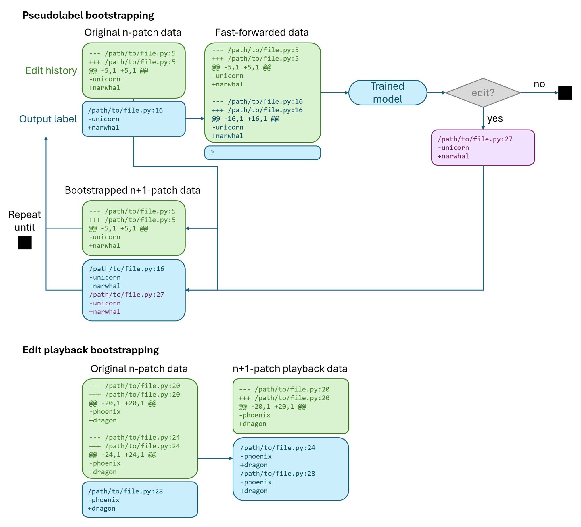
A diagram showing the multi-patch bootstrapping techniques used to generate multi-patch data from single-patch data.

Figure 3. Two processes by which we repeatedly bootstrapped multi-patch data by fast-forwarding single-patch data. Top: We first fast-forwarded the data with n patches in the output by moving the output label into the edit history. If the model produced a response for this fast-forwarded sample, that output would be added to the original sample’s output label to create a response with n+1 patches. Bottom: We performed edit playback by moving recent edits from the edit history to rewind the session state and predict them as part of the model output.

After these approaches yielded enough data, we then filtered the data using an LLM-as-a-judge and rules-based quality filter. The criteria in this filter were distilled from our understanding of developer preferences throughout the development of our preceding code editing models, such as correctness, necessity, and intent and edit history alignment, and the rules-based filters accounted for patch validity and undesirable behaviors like code duplication.

We then used SFT to train a new model on a new mix of this data and the previous NES data, which yielded models that produced 1.3 to 1.4 patches on average, compared to the original near-1 averages. While this number might sound small, we later found this is a sweet spot that makes a significant difference in the user experience without degrading quality. After all, to get an average of 2 patches per response, long-distance edits would need to happen on average at every edit opportunity, which was not the case in the existing production setup with a dedicated long-distance edit model.

RL was applied to the v2 SFT models in a similar fashion, using the same techniques to bootstrap multi-patch data. The grader logic was also altered to incorporate guidance for multi-patch responses. We found this model had much stronger offline results compared to the SFT model.

Patch ordering

When there are multiple edits, the natural question of how to order them comes up. This was also a deliberate choice we made.

During data filtering, in addition to the criteria for edit quality, we also added a new criterion targeting edit ordering requiring a smooth logical flow of the edits through the file in order of priority and proximity to the user’s cursor. This choice sounds intuitive because it was distilled from our experience in orchestrating the three standalone models in the client. The logic was to first query the completions model, followed by the NES model, followed by the cursor jump model and a subsequent NES model call if the cursor jump model chose to jump.

In addition to including these criteria in the data filtering pipeline, we also included them in the RL grader with some additional nuances in the reward function, which we observed was important for prioritizing logically coherent edits.

The Pseudo-Online Evaluation benchmark

The v2 models were a step-function improvement compared to the v1 models in online A/B testing compared to the production three-model control. Aside from the dismissal rates being elevated, all other metrics like acceptance rate, shown rate, accumulated retained characters, and user engagement metrics had no statistically significant movement. But one strange finding emerged: offline results were not very predictive of the online results. One of the strongest offline candidates with the highest-ever score in STests, for instance, did not do as well as another with lower STests in the A/B flight. This got us thinking: how do we close the gap between our offline and online results so we can iterate on model candidates more efficiently and confidently?

The result was a fourth offline benchmark that we call the Pseudo-Online Evaluation (POE). The benchmark consists of three equally-sized sample buckets representing acceptance, rejection, and no edit cases from production model outputs, along with suggestion quality signals. The benchmark runs each of the samples in these groups through the candidate model. It then uses an LLM judge using in-context learning to determine whether the candidate response would be accepted or rejected given the known outcome of that sample.
The most critical metrics that arose from this benchmark were the reject rate (lower being better), accept-to-reject-rate ratio (higher being better) and the ratio of rejects that became no edits to the accepts that became no edits (a measure of whether the model learned to abstain more for previously poor responses without losing previously good responses). We also quantified issues like patch validity errors, which we will talk about later, and other metrics, such as the number of patches in responses. These metrics, while admittedly still not a perfect proxy, became a stronger predictor of online performance for subsequent model candidates.

Grader and quality filter calibration

Developing the POE benchmark also raised another question: were we leaving anything on the table with our new diff patch-specific RL graders? Could we improve it using additional data and quality signals?
We decided to try to calibrate the grader better to user feedback by taking a self-refinement approach to the grader. We developed an agent skill that performed the following loop:

  1. Take the samples from POE and run them through the grader to get the grader’s judgment on the production model response.
  2. Construct the confusion matrix of false positives, false negatives, true positives, and true negatives after running all samples.
  3. Randomly sample examples from each category to understand common failure modes of the grader and patterns in its blind spots.
  4. Adapt the existing grader instructions to incorporate any observed feedback that clearly formed a pattern.
  5. Repeat.

It is worth noting that the quality signals we use are oftentimes noisy. However, through this process, we were able to automatically increase concordance between the RL grader and these quality signals, reducing false negatives by 8.4% and false positives by 1.1%. This improved the reliability of our training, evaluation, and data filtering pipelines.

Tackling invalid patches

Later v2 model variants benefited from the updated RL grader and better offline model selection, but a few other challenges emerged as we dogfooded the models more regularly. One of these challenges was invalid patches.

We noticed that the model would sometimes create patches that were malformed or introduced mistakes that were programmatically verifiable. We characterized patch validity with two tiers: critical issues that impact the user experience, and suboptimal patches that are token-inefficient. We developed fine-grained rules-based filters to catch these issues. An example of a critical issue is duplication of code in the lines preceding or following the line where the user’s cursor is. These are visible to the user and negatively impact the suggestions they receive. In contrast, an example of a suboptimal issue is no-op patches, or patches where additions and deletions are perfectly matched; in other words, patches that completely undo their own work. These were wasteful from a token and latency perspective, but not detrimental to edits presented to the user.

Incorporating these rules-based patch validity checks into the RL grader did decrease the proportion of invalid responses, but it improved less than expected. We turned to examining the distribution of data in our RL dataset and hypothesized that it did not capture the common contexts in production that led to these model errors. To validate this suspicion, we conducted targeted data mining on examples from the latest v2 models that triggered patch validity failures. We ran the responses through our patch validity checks, repaired them automatically using an iterative LLM feedback loop guided by those checks, and filtered the repaired samples for quality. By carefully experimenting with the sampling ratio of these examples during training, we were able to reduce patch validity issues without negatively impacting other scenarios.

One last thing we ablated for the patch validity checks was whether to penalize both critical and suboptimal issues, or just the critical issues. We hypothesized that allowing the model to produce suboptimal patches might clean up the reward signal for reducing critical issues and also have unexpected benefits (e.g., a no-op patch between two valid patches might almost serve as a ‘chain of thought’ as the model thinks through possible edit locations). Indeed, once we removed the penalty for suboptimal patches, we did see more consistent reduction in critical issues without significant detriments in other offline quality metrics.

Training the v3 models: Tackling issues in insertion pattern propagation

As we got closer to a strong shipping candidate, one other persistent issue presented itself through dogfooding: misplaced insertions during pattern propagation, and specifically, correct content with incorrect placement. This was a very specific failure mode of the v2 models when the appropriate response would be to insert new content at another location in the file to propagate a pattern of repeated insertions following user intent. For instance, if the user added the field password after email in a web form, the expectation would be to add the corresponding Password label after the Email label, and a validate_password check after the validate_email check. However, the v2 models were found to frequently place Password before Email, or even at the very bottom of the list of fields.

Building on our learnings from suppressing invalid patch behavior, we approached this problem in two ways.

First, we used LLM judges to identify examples from the v2 model outputs that exhibited this specific failure mode: generating the correct content but placing it incorrectly when user intent implied pattern propagation. This proved surprisingly difficult because long-distance insertion scenarios were relatively rare compared to replacement scenarios. Even after LLM-based response repair and quality filtering, we obtained thousands of positive examples, but only a few hundred negative examples exhibiting the original placement error.
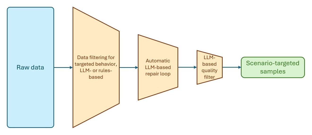
Diagram of the data mining workflow used for targeting problematic behaviors.

Figure 4. The data mining workflow we distilled to target problematic behaviors, such as invalid patches and insertion pattern propagation. Raw data is first collected from model outputs, then filtered to specific problematic examples, then repaired and filtered for quality before being used in training.

After folding this data into both SFT and RL, we did not notice a significant impact on model behavior. We then hypothesized that the positive examples and corrected negative examples did not have the same distribution or value for model learning, so we upweighted the negative examples during RL.

After doing so, we inspected model rollouts during RL training and were surprised to see that the RL grader was not reliably flagging insertion pattern propagation errors of this type despite the sufficient data representation. Because of the multiple objectives in the already complex grader, to avoid destabilizing the existing grader behavior, we developed a new technique for the RL grader that introduced a new auxiliary grader to specifically address the insertion pattern-following deficit in the primary grader. We gated this grader to examples that had insertions in the ground truth or prediction.

Altogether, the targeted examples, hard example upweighting, and grader changes ultimately corrected the models’ problematic insertion behavior, resulting in the v3 models. This combination of data representation, data balancing, and grader augmentation was a very important learning for us, and a technique we would reuse again when developing the 3-in-1 model.

The Qualitative Must-Haves benchmark

The challenges we faced with the insertion pattern propagation issue, which surfaced only through dogfooding and not through flighting nor through offline evaluation, led us to think about the potential gaps in our existing evaluation methodology. This prompted us to develop a fifth offline evaluation benchmark, Qualitative Must-Haves (QMH), which is a living curated collection of scenarios that previous and current models have found challenging, often discovered through dogfooding.

The objective of this benchmark is distinct from the others. While the others are larger-scale and quantitative, we deliberately kept this one lean and small so that it could serve as a “canary” set to flag issues with models and filter out or rule in model candidates quickly. In addition, it focuses more on preventing past bad behaviors than generically measuring model quality. The name is somewhat of a misnomer, though, as it eventually became quantitative as we developed LLM judges that could serve as human proxies for judging the results.

Both our 2-in-1 and 3-in-1 modeling efforts have greatly benefited from this benchmark as a heuristic for model regressions and potential user frustration, as well as the quick iteration it has enabled due to its small size. We also further included scenarios we added to the QMH dataset in the larger-scale human evaluations that we do at scale.

One of our greatest learnings in developing this benchmark has been that because the models we train have shared data and training pipelines, problematic behaviors can crop up again in future models if not carefully monitored, especially if future models have different objectives, such as adding a new feature. Having a small set of samples that measure critical behaviors that can quickly flag regressions, or if used proactively, prevent possible regressions, has been a game-changer for model selection. It is worth noting that for this set to be reliable, it must have good coverage, so spending time to curate the examples and making sure they are a fair representation of past and potential regressions has been important.

Another learning to underscore is the importance of dogfooding. Nothing beats trying it out yourself, especially as not everything can be captured perfectly on a quantitative scorecard. Testing the boundaries of the model ourselves as end users provides a unique perspective. As developers of products for developers, we consider this mandatory and an important part of the culture we pride ourselves on in providing high-quality code editing models.

Diagram illustrating the model selection process, showing how evaluation benchmarks, human feedback, dogfooding, and online experimentation are combined to compare and choose candidate models.

Figure 5. Our model selection process was refined to leverage the insights gained in each step to efficiently narrow down model candidates, from early filtering using QMH to extensive offline evaluation to dogfooding to online flighting. All intermediate steps in this process are valuable evaluation signals and can also loop back to inform another round of model training.

Takeaways and learnings

Unifying NES and long-distance edits hinged on reformulating the output as a single diff patch format. This one representation could express every prior task and, critically, chain multiple edits into a multi-patch response, which was the foundation for a low-latency tab-tab-tab flow. A few core lessons stood out:

  1. Bootstrap data when pioneering new scenarios. Multi-patch training data didn’t exist, so we synthesized it from single-edit data using pseudolabels and edit playback, followed by quality filtering. This formed the foundation of the SFT and RL data to start the flywheel of multi-patch model development.
  2. A repeatable recipe emerged for fixing specific failure modes. Targeted examples, hard-example upweighting, and a gated auxiliary grader were critical to refining the model from a good model into a shipping candidate. It fixed issues of invalid patches and insertion-pattern propagation, and became our go-to technique going forward.
  3. Try to close the offline-to-online gap. This drove the Pseudo-Online Evaluation (POE) benchmark and a self-refinement loop to calibrate the grader against model outputs and quality signals, and tightening the offline to online gap led to faster and more confident experimentation.
  4. Bring tried and true lessons and intuition into new territory. In both the data filter and the RL grader, we enforced the guideline that edits must flow logically outward by priority and proximity to the cursor. This arose from our experience in orchestrating a successful experience for inline suggestions in the three-model setup.
  5. Dogfooding can catch what metrics are missing. Issues that were invisible offline and online surfaced only through daily use, motivating the small Qualitative Must-Haves “canary” benchmark to guard against regressions in shared pipelines.

Online results

We flighted 2-in-1 model candidates against the production baseline of the three standalone models (completions, NES, and cursor jump). The final shipping candidate was observed to have no statistically significant regressions in any key metrics (acceptance rate, dismissal rate, shown rate, recurring engagement, and accumulated retained characters). In addition, we saw a decrease of 10% in the time it took for suggestions to be shown to the user, along with a reduction of 61% in output tokens. These were mostly due to the more efficient output and input formats and more streamlined client logic.

Try it out

The unified Inline Suggestions experience is available now for paid GitHub Copilot users in VS Code. Update to the latest version of VS Code, then make sure next edit suggestions are enabled.

Give it a try the next time you are in the editor, whether you’re working on a refactor or writing a new function. We hope you enjoy the tab-tab-tab experience and we’d love to hear your feedback!

In the second part of this blog post, we’ll dive deeper into how we moved to the 3-in-1 model for inline suggestions. Stay tuned!

Acknowledgements

Special thanks to Luciana Abud, Alexandru Dima, Yu Hu, Simona Liao, Shengjie Ma, Elsie Nallipogu, and Nick Trogh for their thoughtful feedback, insights, and contributions to this blog post.

We extend our deepest gratitude to our developer community for the ongoing feedback that pushes us to deliver the best possible experiences with VS Code and GitHub Copilot. Huge thanks to the researchers, engineers, product managers, and designers across GitHub and Microsoft who curated the training data, built the training pipeline, evaluation suites, and serving stack, and to the VS Code and GitHub Copilot teams for smooth model releases.

Happy coding! 💙
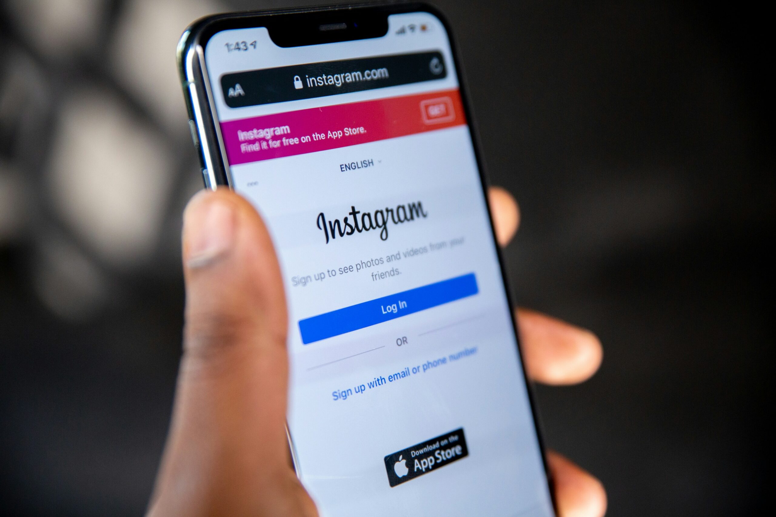
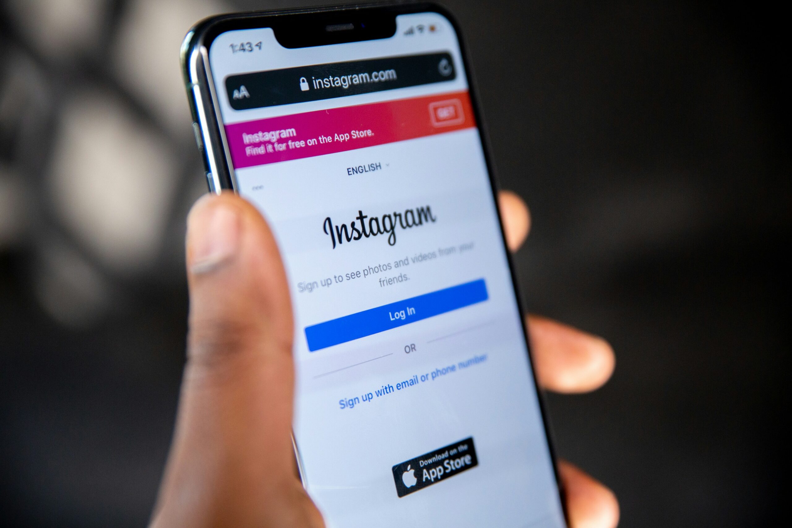
8 Instagram Tracking Techniques Made Easier With FollowSpy


Android phone open to Instagram

Instagram tracking is useful when a person needs to separate visible activity from assumptions. A long follower or following list can show connections, but it is much harder to identify what changed recently without a clear order or a repeatable checking method.

That is where tracking techniques become practical. Instead of treating one profile visit as evidence of a pattern, a researcher, creator, social media manager, or someone checking relationship concerns can focus on specific public changes such as a new follow, a new follower, an unfollow, or a recently posted Story. FollowSpy lists personal checking, creator research, marketing, community management, and research among the uses of its public Instagram tracking tools.

FollowSpy combines follower tracking with anonymous Story viewing. Its follower tracker says it can show recent followers, recent following activity, unfollows, and connections sorted from newest to oldest, while the Story Viewer is limited to public Stories and does not require an Instagram login.

The FollowSpy instagram follower tracker gives that process a single starting point because it organizes public follower and following activity chronologically. The service states that the checked account is not notified when its public follower or following activity is viewed, which makes repeated checks discreet.

Eight Techniques at a Glance

The most useful approach is to treat each feature as a separate observation rather than as a shortcut to conclusions. FollowSpy currently provides the follower, following, unfollow, real time update, and anonymous public Story functions that support the eight techniques below.

  • Check who an account followed most recently.
  • Review the newest followers separately.
  • Watch for unfollows.
  • Compare changes on both sides of the connection.
  • Use real time updates during an active check.
  • Recheck the same public account to spot changes over time.
  • View public Stories anonymously for content context.
  • Use Story posting times to see which active updates are newest.

1 and 2. Separate Recent Following From Recent Followers

The first technique is to open the following list in chronological order and start with the newest accounts. FollowSpy states that its tracker sorts follows from the most recent back to the oldest, which removes the need to scan a shuffled list and guess which connection is new.

The second technique looks in the opposite direction. Recent followers show who has newly connected to the tracked public account, while recent following shows whom that account chose to follow. FollowSpy displays both categories and states that new follower and following activity can be viewed separately.

3 and 4. Watch Unfollows and Compare Both Sides

An unfollow is another visible change that can be easy to miss during manual checking. FollowSpy states that its tracker identifies unfollows on public accounts and places this activity in its own view instead of requiring a person to remember who used to be present.

The fourth technique is comparison. A new follower and a new following entry may appear close together, but they represent different actions, so reviewing both sides helps keep the observation precise. FollowSpy provides separate follower and following data for this purpose.

This matters in relationship focused checking, one of the use cases FollowSpy itself identifies. The tool can show public connection changes, but those changes alone do not establish intent, private communication, or the reason one person followed another. The factual observation is the connection change itself.

5 and 6. Use Real Time Checks, Then Recheck the Baseline

FollowSpy says follower and following data can update in real time while a public profile is being viewed. That makes a live check useful when the goal is to see whether a new connection appears during the monitoring session.

A single check still provides only one view of the account. Rechecking the same public profile makes comparison easier because the newest activity remains organized chronologically, with newer connections shown before older ones.

For a social media manager, this can mean watching follower churn around an account or campaign. FollowSpy’s official site lists social media and community managers among its intended users and specifically mentions tracking follower churn and audience changes.

For personal use, the same technique is better treated as a change log than a judgment tool. FollowSpy can confirm visible public follower activity, while private conversations and other nonpublic information remain outside what the service says it accesses.

7. Add Anonymous Story Viewing for Public Content Context

Follower activity shows connections, while Stories provide another form of public account activity. FollowSpy’s Story Viewer is designed for public accounts and states that a viewer’s name does not appear in the Story viewer list.

That distinction can add context without adding visible interaction. A creator studying another public creator, for example, can review recent public connection activity and then check the account’s active public Stories without appearing in the Story viewer list. FollowSpy lists creators and influencers among the audiences for this type of research.

The Story Viewer also works without an Instagram login, according to FollowSpy. Its official page says active public Stories can be accessed in a browser on desktop, tablet, or phone without requiring an app installation or browser extension.

Story viewing can also help when timing matters. FollowSpy displays the posting time for active Stories, which makes it possible to distinguish a recent Story from one that has already been available for many hours.

Still, Story content should be read as public content rather than proof of why a follow happened. FollowSpy states that it accesses publicly available information and cannot display private account Stories or private follower and following lists.

8. Turn Individual Checks Into a Repeatable Tracking Workflow

The eighth technique is procedural. Instead of opening a profile and looking randomly through its activity, the same sequence can be used for each check so different types of public activity remain separate.

A practical workflow begins with a public username, followed by recent following, recent followers, and unfollows. If content context matters, active public Stories can then be reviewed anonymously together with their posting times. These functions are all described on FollowSpy’s official follower tracker and Story Viewer pages.


This workflow also reflects FollowSpy’s main limitation. The service states that it only accesses publicly available Instagram data, so private account follower lists and private Stories are not available through these tools.

That limitation defines what the result actually represents. FollowSpy can organize public Instagram activity and make recent changes easier to revisit, but its documented functionality does not provide access to private account information.

For creators, marketers, community managers, researchers, or people checking relationship concerns, the practical use is structured observation. FollowSpy’s chronological lists, unfollow detection, real time updates, and anonymous public Story viewing reduce the amount of manual checking needed to identify visible activity changes.

The eight techniques work best as a repeatable process rather than as a one click explanation for someone’s behavior. They separate following activity, follower activity, unfollows, and public Stories into clearer signals while keeping conclusions distinct from what the public data actually shows.

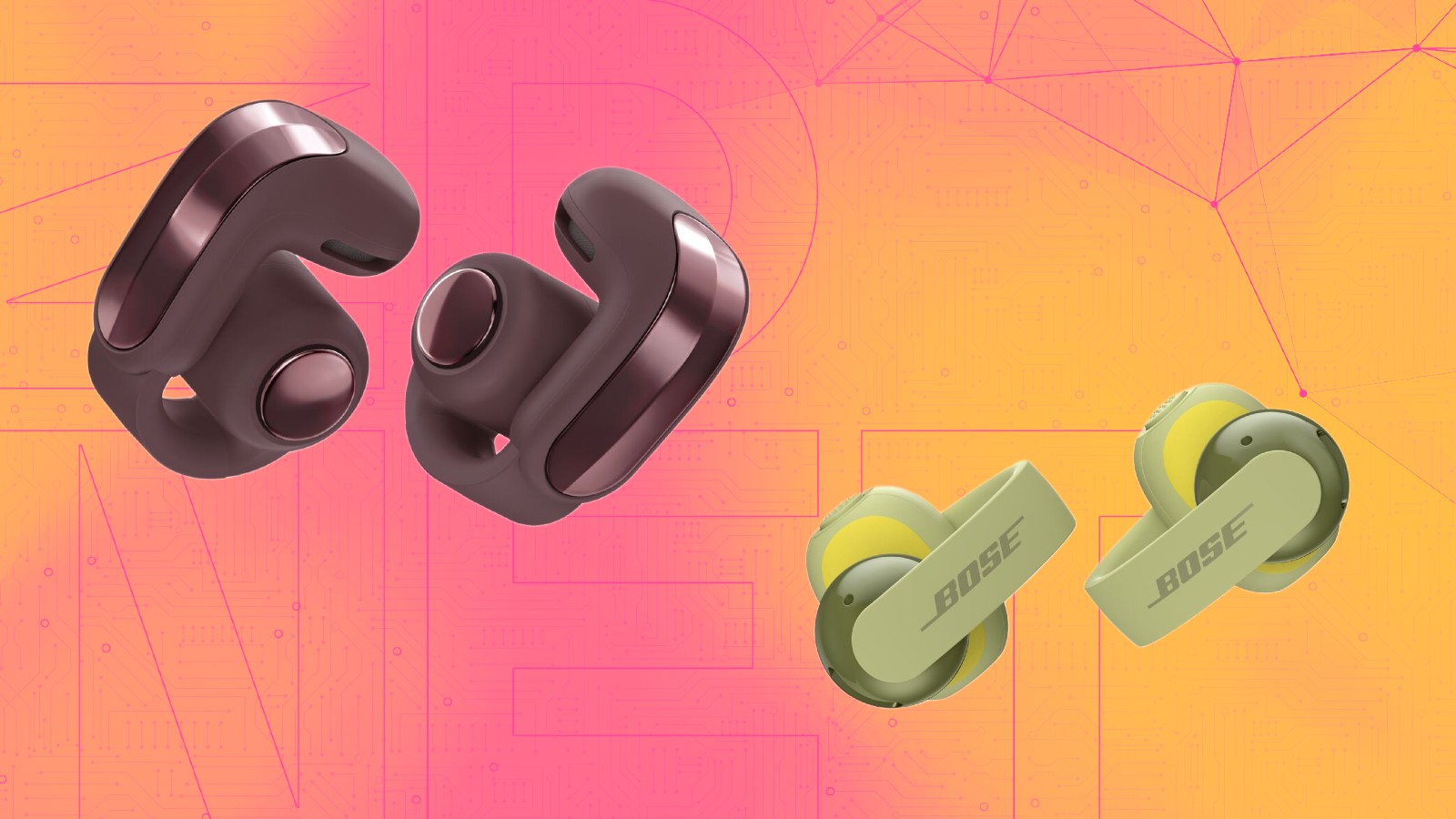
Bose returns with new open earbuds (and a refreshed favorite)


Jada Jones/ZDNET

ZDNET’s key takeaways

  • Bose announces two clip-on open earbuds.
  • The Sport Open is ideal for exercise, while the Ultra Open (2nd Gen) provides a premium experience.
  • Both will be available beginning Oct. 1.

Following the release of the second-gen QuietComfort Headphones, Bose returns with two new open-ear options: the Sport Open Earbuds and the Ultra Open Earbuds (2nd Gen). 

Also: Sony vs. Bose isn’t a draw when it comes to open-style earbuds – here’s how they differ

Bose’s open-ear clip-on earbuds are among our favorites, and the company is expanding its lineup to accommodate different types of open-ear fans. The upgraded second-gen Ultra Open builds on premium Bose audio technologies, signaling that it’ll best suit those seeking an elevated experience in an open-ear form factor.

Meanwhile, the Sport Open Earbuds are a new Bose product category that appeals to those seeking open-ear earbuds for their active lifestyles.

Ultra Open Earbuds

We’ve rated Bose’s Ultra Open buds highly for their rich sound, sleek design, and all-day comfort. Bose says its second-gen open-ear buds have improved audio reproduction, specifically deeper bass, louder volume, and clearer calls.

Additionally, the Ultra Open (2nd Gen) will have a new Immersive Audio mode: Cinema. With a new spatial audio mode, intelligent auto volume adjustment, and improved voice pickup technologies, Bose positions the second-gen Ultra Open as premium open-ear headphones for everyday use.

The Ultra Open Earbuds (2nd Gen) will also support AptX codecs for hi-res audio over a wireless connection (with a compatible source device), Google Fast Pair, and Google Find Hub.

Also: I replaced my Bose Ultra Open with these Shokz headphones – they’re better for less money

Sony’s LinkBuds Clip also delivers improved voice pickup and stellar audio, but Bose’s designs are usually more refined and stylish, while Sony opts for plastic builds and uniform design language.

The Bose Ultra Open Earbuds (2nd Gen) will be available for $299 in Black and White Smoke.

Sport Open Earbuds

The $199 Sport Open Earbuds lie below the $299 Open Ultra Earbuds, but Bose says its cheaper open-ear buds are built for “running, workouts, and outdoor activities.” The Sport Open buds feature an IP54 durability rating, meaning they are dust-protected and can withstand splashes of water.

Thus, the Sport Open is suitable for runs or hikes in dusty conditions and can withstand bouts of rain or particularly sweaty workouts. On-device button controls are on deck, ideal for pausing, playing, or skipping tracks during a run or walk without pulling out your phone.

Also: I swapped my Shokz with these bass-heavy bone conduction headphones

Bose’s midrange clip-on buds aren’t as durable as the IP57-rated Shokz OpenDots 2, though I’ve found that Bose tends to offer a sleeker design and more color options. However, like its Shokz counterpart, the Sport Open buds support Bluetooth multipoint connectivity, Google Fast Pair, and Google Find Hub.

The Bose Sport Open Earbuds will be available for $199 in Black and White Smoke.

Photoreal CGI: What It Takes to Design Top-Quality Product 3D Renderings & Visualizations


Let’s begin with a question: what is the end goal of photoreal computer-generated imagery (CGI)? To create imagery so lifelike you almost can’t distinguish it from an actual photograph. An increasing number of companies and design agencies of all sizes now rely on CGI, more specifically 3D rendering services, to communicate ideas or concepts with stakeholders, and eventually market the final products to consumers at large. This doesn’t mean conventional photography has been completely abandoned. Still, it’s safe to say that the vast majority of product images you see today are computer-generated, or at least a combination of CGI and real photographs.

Are all CGI photorealistic? Not always. It all depends on the style you want. Some digital artists excel at generating a product visualization identical to the actual physical object, while others specialize in stylized imagery for cinematic and dramatic flair. At Cad Crowd, you’ll find professionals capable of both approaches, giving you the best blend of photorealism and artistic touches.

RELATED: 3D Product Visualization: Elevating Your Online Shopping Experience and Service for Modern Consumers


🚀 Table of contents


Hallmarks of great product visualizations

Why not just take some photographs, then? Seems like a no-brainer question considering how simple it is to fire up the camera and take some product snapshots. But you must remember that to produce any product image at all, photography needs the product to exist in the first place. In an NPD (New Product Development) project where the design is yet to exist, CGI has the clear advantage.

​Flexibility is another major advantage of CGI services, as 3D rendering offers the freedom to visualize otherwise photographically impossible cutaways, exploded component views, the inner mechanism of a product, microscopic close-ups, etc. At the same time, thanks to the “virtual” nature of 3D rendering, you can modify and reuse the image without having to rely on the physical product. For instance, if you plan to offer a product in dozens or more color combinations or variants, a digital artist can get them all done much faster than even a professional photographer.

​A marketing head start is also an upper hand you can’t take for granted. The ability to market a product (because you have a photorealistic visualization of it already made) before the actual launch date or even before the mass-manufacturing process begins gives you a massive head start to gain a real competitive advantage. And if you’re confident enough about the product quality at this point, no one is stopping you from taking pre-orders or crowdfunded investments.

RELATED: How To Visualize Consumer Products Using 3D Rendering Services For Your Company and Firm 

​Cad Crowd gives you easy access to some of the world’s most talented CGI professionals and digital artists with the know-how and the experience in 3D product renderings of any category, whether electronics, mechanical, medical, or industrial, or any combination of those. Truly effective photorealistic visualizations aren’t the stuff of amateurs. 

It takes an in-depth understanding of how 3D modeling, the physics of light behaviors, familiarity with surface textures, and, yes, camerawork, among others. It’s a specialized trade best left to professionals armed with insights, artistic touches, and certainly the right tools to bring about and put together these ingredients to craft top-quality product visualizations.

Precise 3D modeling

Rendering doesn’t happen without 3D modeling. Every design must first be 3D modeled using CAD software. However, not every visualization project starts from scratch. For example, if the product already exists and you want a CGI version of it, we can build the model based on photographs using the photogrammetry technique or a 3D scanner to generate the basic shape and layout. 

RELATED: Product Rendering and 3D Visualization – A Full Overview

mastering-photorealistic-product-visualization-with-cgi

The resulting model from either method is geometrically accurate, but it just doesn’t have enough detail (yet) for photorealistic rendering. It still needs some refinements in materials, textures, and colors to make it more presentable. Keep in mind that scanning and photogrammetry only cover the product’s surface area. In case the rendering has to showcase the inner mechanism, such as in an exploded view format, disassembly might be required.

​Whether we start with an existing product or a mere concept from a napkin sketch, the bulk of the 3D modeling work services is done using advanced tools like Autodesk Fusion, SolidWorks, Blender, Rhinoceros 3D, and Shapr3D, to name a few. Software choice is indeed important, although the professional sitting in front of the computer still makes all the difference between top-notch accurate models and poorly built assets. And the more accurate and detailed the 3D models are, the better the final 3D rendering will be.

Material details and texture mapping

On top of the bare 3D model of a product, there need to be material details and surface properties. Your product, or at least its outer body, might be made of wood, plastic, metal or metal alloy, leather, glass, etc. Each material comes with its own set of characteristics, which ultimately affects the degree of realism during the latter stages of the process.

RELATED: 3D Product Rendering Styles that Elevate Marketing with Design Companies & Freelance Services 

For instance, polished and brushed stainless steel have different degrees of reflectiveness and shine; when exposed to light in the rendering phase, the materials generate unique lighting effects and create distinct visuals. The sense of photorealism is also heavily affected by the lighting configuration itself, but this is to be discussed later.

​Still on the subject of accurate geometry, “hard edges” deserve specific attention here. With the exception of parts/components that are actually intended to be sharp, like glass corners or the actual edge of a knife or razor, most objects in the real world have no hard edge. A lot of products tend to avoid such a thing simply because it makes an object uncomfortable to hold and use at best, and is a safety hazard at worst. When the geometry drawing seems to suggest that an object comes with hard edges, like the corners of a square, they’re usually rounded off.

If you take a close look at the edge of a tabletop, it’s likely beveled for comfort. Not even a speed square has a perfect 90-degree angle anywhere on it. In 3D modeling services, it’s easy to fall into the trap of making anything geometrically precise. No one is against accuracy, although in this particular case, the precision can backfire. Softening hard edges is the right thing to do, not only because they’re not recommended in manufacturing, but beveled edges (no matter how unnoticeable they may seem) do make the rendering more realistic.

RELATED: Concept to Reality: How Product Rendering Services Transforms Companies Products & Marketing

how-photorealistic-cgi-improves-product-marketing

​On top of the material, there’s another defining layer in the form of texture. We use only high-resolution textures and shades to best reproduce the real-world look and feel of an object’s surface properties. As briefly mentioned earlier, the same material can have different textures. Stainless steel, or metal in general, isn’t the only material with this peculiarity. Plastic can be clear, matte, or perhaps colored; leathers might be smooth or coarse; woods come with different grain patterns, and so forth. We apply texture to the material surface using either a texture mapping technique, which basically utilizes a projection of a texture onto the surface of the 3D model, or digital painting.

​Remember that 3D modeling isn’t just for the product. The environments must be modeled, too. Say your product is a bottle opener. You have the option to display the object as a stand-alone visualization against a plain backdrop, or put it in a scene along with other accompanying objects, for example in a kitchen setting. The former is excellent if you want to showcase the product in a close-up view, whereas the latter (commonly referred to as lifestyle rendering) delivers a better realism effect. A product placed in its natural environment looks more believable.

Lights and shadows

Now come the most important rendering factors of them all: lights and shadows. Yes, the 3D models are clearly visible on the computer screen already, but they’re not exactly photorealistic, aren’t they? The problem is, there can be thousands of different lighting setups, and an even bigger problem is that most of them won’t deliver the desired realism effects. One of the great misconceptions in 3D rendering services is that more lighting creates better visualization. You can’t be any more wrong than that. Let’s refer back to our previous example of a bottle opener. First, we need to consider the rendering scene you need. A bottle opener can be displayed in an indoor space (a kitchen, living room, a tent) or an outdoor area (the backyard, the beach, the back of a pickup truck). Either way, the product won’t look out of place so long as the lighting is set to complement the environment.

RELATED: How Can 3D Digital Product Rendering Boost My Company’s Marketing Material ROI?

​An indoor space often makes use of artificial lighting such as an overhead lamp or a portable rechargeable LED emergency lantern, especially if it’s placed in a tent. An overhead lamp can be in the form of a chandelier, ceiling-mounted, or pendant light. A portable lantern also offers models with different brightness levels and color temperatures. It’s worth mentioning that an indoor space can have windows to let natural light sources come through. As for the outdoor area, your main source of light is the sun, but the intensity varies depending on time of day, season, and weather. You wouldn’t want a product visualization made for sunset and sunrise to look the same. The point is, you have loads of options to do the lighting setup.

​Shadows are just as important and complex. They define contrast and depth, without which the realism effect suffers a great deal. Shadows must be the direct consequence of the presence of light. However, different light sources and setups should not and cannot cast the same shadows. The intensity, direction, reflection, absorption, and refraction of light as they hit an object determine the nature of the shadows. 

For example, a spotlight hitting directly at an object will cast sharp, defined shadows; on the contrary, if the object is placed next to a glass window that merely allows sunlight to come through from the outside, its shadows are typically softer and diffused. The window size and whether the glass is tinted further increase the complexity. Adding to the intricacy are the object’s materials and surface textures that play a role in how light behaves as it bounces off them.

RELATED: How Photorealistic 3D Rendering Design Saves Companies Money

​One might argue that shadows are nothing but byproducts of lighting. It does hold some truth in the sense that every light casts shadows. That said, in the world of 3D rendering at least, shadows actually enrich the scene and bring forth the perception of space. They might look like dark blotches under and behind an object, but nonetheless integral elements of photorealism design project services. We can’t have light without shadows, but it also doesn’t mean we can’t manipulate them to work to the benefit of the visualization.

photorealistic-cgi-product-rendering-best-practices

​There’s no denying that different light sources, types, and positioning result in a large variation of shadow quality. They’re among the hallmarks of the nuances and complexities of real-world settings. The digital artists at Cad Crowd understand the challenges as well as the importance of dealing with light setups in 3D rendering applications. At the same time, we’ve been honed by years of experience in product design CGI to imitate and reproduce the physics of how light and shadows intertwine as features in photorealistic rendering.

Key, fill, and rim

Nothing screams top-quality product 3D renderings and visualization services better than true-to-life lighting. We might use a three-light studio setup to simulate the human’s natural perception of an object, in this case your product. Such a setup allows us to mimic a large variety of light sources and configurations in a realistic fashion to the point where it tricks the viewers’ minds into thinking that they’re looking at an actual photograph. As the name suggests, the setup consists of three light sources: key, fill, and rim (backlight).

RELATED: 3D Product Visualization: 10 Ways to Present 3D Images to Drive Your Sales

  • Key light: the primary light source that illuminates not only the main object, but the entire scene. This will cast shadows that might be too intense for comfort. If the purpose is simply to see the image, this light source alone would be enough.
  • Fill light: to enhance the photorealism effect, a fill light is necessary to reduce shadow intensity and soften the difference between dark and bright spots. A fill light should be dimmer than a key light, yet bright enough to do what it’s supposed to do.
  • Rim (backlight): none of the other two separate the background from the main object, and that’s where rim light comes in. A rim light is aimed toward the back side of the object to help accentuate its shape.

The setup is very similar to that employed by an actual professional photography studio, except in 3D rendering, all the configurations are done on a computer screen. It offers the versatility and control that enable a digital artist to experiment with light placements, color temperature, directions, and brightness quickly. This is also how we play with shadows, mood, styles, and depth to get to the desired visual impact.

RELATED: Top 51 3D Product Rendering Design & Best 3D Visualization Services Companies in the US

Post-processing

Despite all the tools and options afforded by 3D rendering software, it’s almost impossible to get everything 100% right without image post-processing. Once the 3D models are rendered, with all the complex lighting setups, the resulting image still needs some final touches to adjust the brightness, saturation, contrast, color balance, and exposure. A professional image editing software is sufficient for this purpose because at this point the 3D models have already been transformed into a rendering, which essentially is just an image.

​An important step in post-processing is tone mapping to make sure that the tonal values get distributed across the image correctly. For example, a digital artist reduces the brightness of the backlight so that it doesn’t overpower the key and fill lights. A lot of camera effects such as vignetting, motion blur, and depth of field might be configured in post-processing as well.

​Let’s not forget about denoising, too. While it might seem like an inconsequential step, denoising helps ensure consistency in overall image quality. As you apply more visual effects in post-processing, there will be more visible noise in the image. Even simple stuff like chromatic effects or bokeh (for depth of field) will introduce noise. At the very least, denoising helps keep every visual filter in check; you get all the good things from post-processing without getting the unnecessary artifacts.

RELATED: How CAD Modernizes Product Concept Design at Industrial Design Services Companies

Estimated cost of photorealistic CGI & 3D rendering services

Service Typical Cost (USD) Description
3D product modeling $300–$1,500 Builds an accurate 3D CAD model from sketches, drawings, or existing products.
Photorealistic product rendering $200–$1,000 per image Creates high-resolution, realistic product images for presentations and marketing.
Lifestyle scene rendering $500–$2,000 Places the product in a realistic environment to showcase real-world use.
Exploded or cutaway rendering $800–$3,000 Visualizes internal components or product assemblies for technical communication.
Product animation $2,000–$10,000+ Produces animated videos demonstrating product features, movement, or assembly.
Interactive 360° visualization $1,000–$5,000 Allows customers to rotate and inspect products from every angle online.

Closing thoughts

Photorealistic CGI professionals with 3D rendering hasn’t completely replaced conventional photography. Many product images you see on e-commerce sites are real photographs, but more companies have now turned to CGI for its visual impacts, versatility, and cost-efficiency in the long run. CGI takes all the good things about camerawork, implements the techniques to generate virtual images, and sprinkles them with the benefits of digital modeling.

​Left to the hands of experienced professionals at Cad Crowd, what you get is more than just pretty imagery but a versatile design asset to help communicate ideas, gain feedback, and generate interest from the public even before production begins. When used as a product marketing picture, CGI gives you the freedom to frame the product in any way you want without using any physical object at all. You can display the product as if it’s floating in space, hovering inside a volcano, gliding underwater, or just lying on the table in front of the TV.  Imagine how much it costs to do all of those with conventional photography. Thanks to 3D rendering, however, everything is achievable at a fraction of the cost without sacrificing the degree of believability.

RELATED: Design Agency vs. End-to-End Product Development Partner for Successful Products

How Cad Crowd can help

Creating photorealistic product renderings requires expertise in 3D modeling, materials, lighting, and visualization. Cad Crowd connects you with experienced CGI artists and CAD professionals who can produce realistic product images, lifestyle renders, exploded views, and marketing visuals that help communicate your ideas and showcase your products with confidence. Request a free quote today and find the right 3D rendering expert for your next project.

author avatar

MacKenzie Brown is the founder and CEO of Cad Crowd. With over 18 years of experience in launching and scaling platforms specializing in CAD services, product design, manufacturing, hardware, and software development, MacKenzie is a recognized authority in the engineering industry. Under his leadership, Cad Crowd serves esteemed clients like NASA, JPL, the U.S. Navy, and Fortune 500 companies, empowering innovators with access to high-quality design and engineering talent.

Connect with me: LinkedIn ✦ X ✦ Cad Crowd

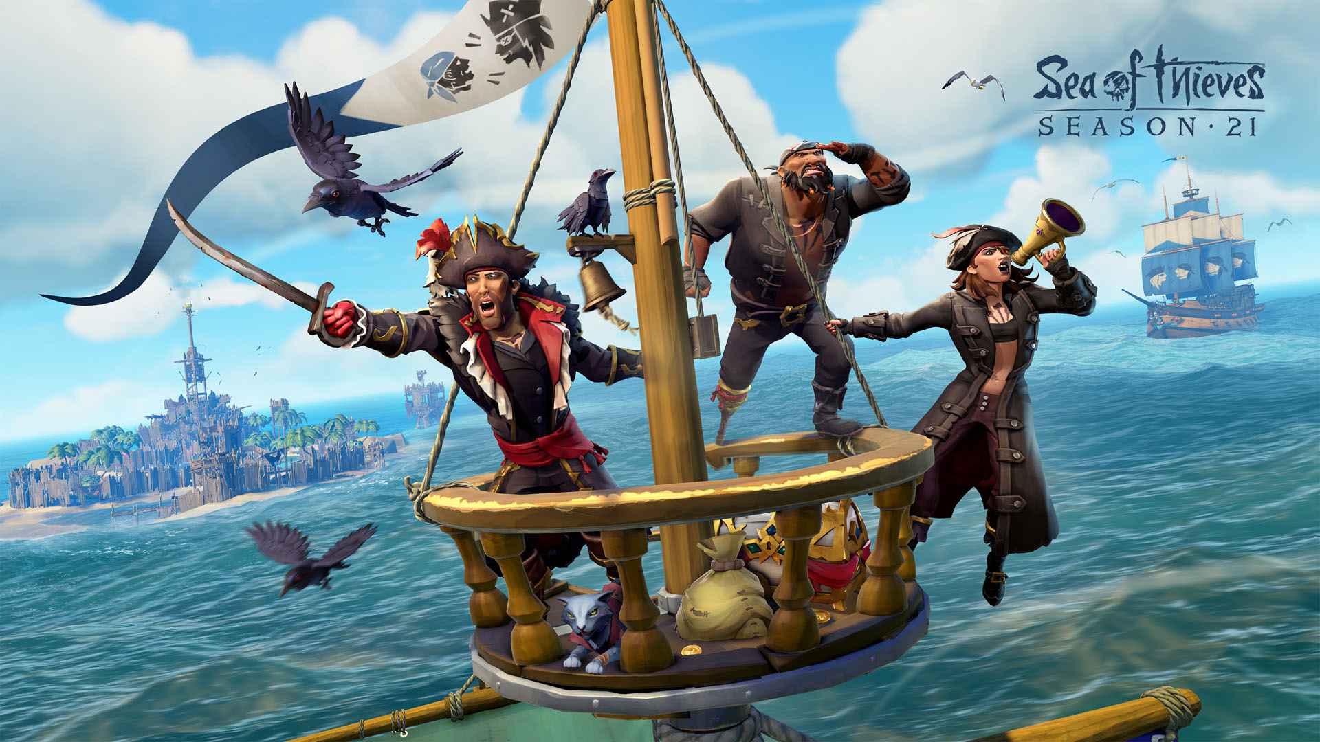
Sea of Thieves: Season 21, Talk Like a Pirate Day, New Rewards, Amazing Prizes and More!


Sea of Thieves: Season 21 is landing, and everyone’s welcome on the waves in time for Talk like a Pirate Day – we’re bringing new items, rewards, and sweepstakes for amazing prizes.

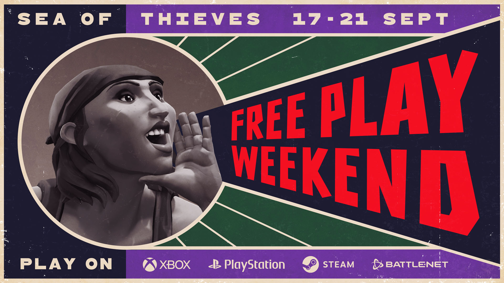
And it all starts with a Free Play Weekend. From September 17 at 15:00 UTC (through to September 21 17:00 UTC), Rare’s shared-world pirate adventure will be free to install and enjoy across all supported platforms, with no XBOX Game Pass subscription required to join the online fun.

With plenty of fresh-faced pirates on the horizon there’ll be no shortage of new friends and foes to meet, and this is where the new Parley Pennant comes in. Once this is equipped via your ship’s flag box, pirates who sail in range of your ship will be informed that you’re looking to talk, at which point you could suggest an Alliance, tackle some challenges together or just show off your favourite tattoos – the choice is yours! Chatty crews who make good use of their pennant during the in-game Talk like a Pirate Day Event will also net themselves the Parley Proficiency Sails.

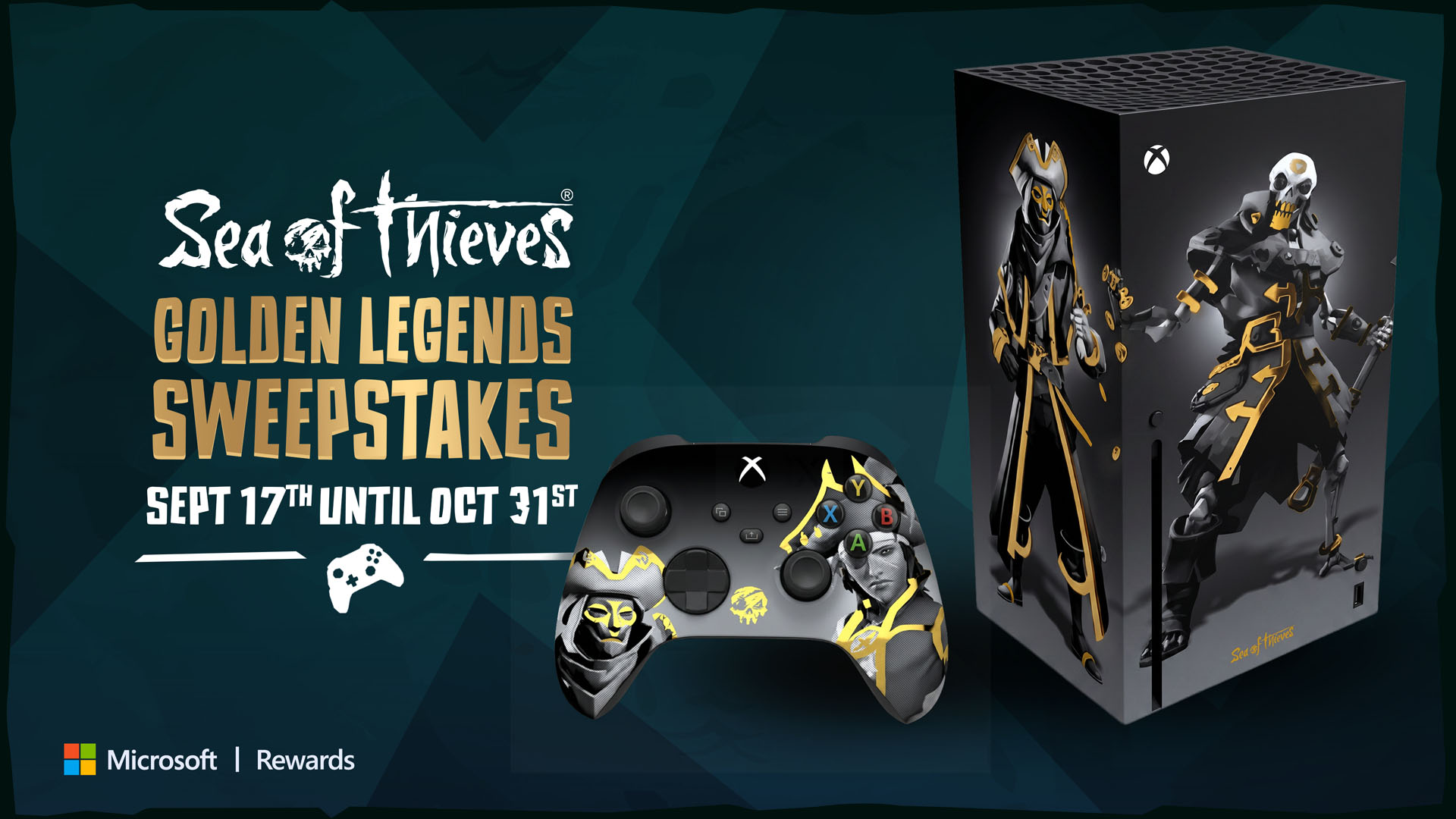
And if there’s anything that’s sure to get pirate tongues wagging, it’s the prospect of claiming both gold and glory in the Microsoft Rewards Sea of Thieves: Golden Legends Sweepstakes, beginning September 17 and running until October 31 in the US, Canada, Mexico, UK, France, Germany and Netherlands.

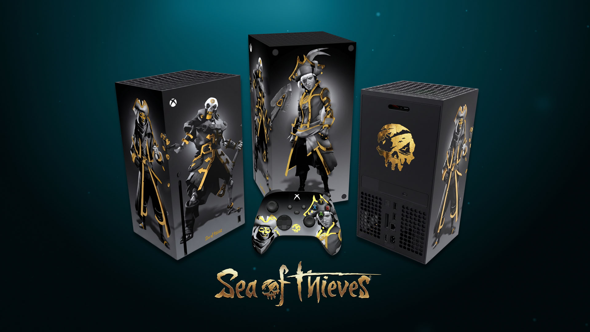
This sweepstake will allow participants to download Bing wallpapers, or use Microsoft Reward points  to enter a prize draw in hopes of winning a one-of-a-kind Golden Legends Xbox Series X and matching controller, along with one year of XBOX Game Pass Premium. Additional controllers and subscriptions will also be up for grabs as second-place prizes in each territory (terms apply).

Microsoft Reward Points can also be used in participating territories to acquire Ancient Coins that fund your Pirate Emporium shopping sprees, and for a limited time there’s an additional talkative treat included in the bundles – the Loquacious Figurehead. And just in case there are any lingering doubts about your commitment to conversation, XBOX Game Pass subscribers can grab the Vociferous Speaking Trumpet as an in-game benefit between September 17 and October 31.

But if all of that high-seas hollering has drained your social reserves, you can sit back and bask in the eerie silence of a battle’s aftermath. Lone Survivor, a new Dynamic Background for your XBOX, can now be selected from the Personalisation Menu at any time.

There’s plenty more to look forward to in Season 21 of Sea of Thieves; a packed calendar of regular Events like Fight Nights and Bilge Rats Weekenders, new gameplay features – including continuing expansions to the recently-added Custom Seas mode – bonuses celebrating 25 years of XBOX, and more.

And, of course, a refreshed Seasonal track has a raft of new rewards for you to unlock however you choose to play, with the promise of the Flame’s Light Lantern awaiting at its end. So be sure to set sail this Talk like a Pirate Day, raise your Parley Pennant, and dive into adventure!

Xbox Play Anywhere

Sea of Thieves: 2026 Edition

Microsoft Studios


☆☆☆☆☆
21679


★★★★★


$39.99

$13.99


Xbox One X Enhanced


PC Game Pass


Xbox Game Pass


Sea of Thieves is a smash-hit pirate adventure game, offering the quintessential pirate experience of plundering lost treasures, fighting intense battles, vanquishing sea monsters and more.

Additional digital bonuses* include access to the Sea of Thieves Original Soundtrack – 2026 Edition, the Sea of Thieves: Athena’s Fortune audiobook and The Rough Guide to Sea of Thieves eBook.

* A Sea of Thieves website login is required to access the digital bonuses – visit www.seaofthieves.com/bonuses online and follow the instructions.

Visual Studio Code 1.139 (Insiders)


Follow us on LinkedIn, X, Bluesky, Instagram | Follow Insiders Changelog on X or Bluesky


Last updated: September 16, 2026

Welcome to the 1.139 Insiders release of Visual Studio Code.

These release notes cover the Insiders build of VS Code and continue to evolve as new features are added.

You can still track our progress in the Commit log and our list of Closed issues.

These release notes were generated using GitHub Copilot and might contain inaccuracies.

Happy Coding!


September 15, 2026

September 14, 2026

September 11, 2026


We really appreciate people trying our new features as soon as they are ready, so check back here often and learn what’s new.