Meta reported record quarterly and annual revenue, topping $59.89 billion in Q4 2025 and $200.97 billion for the full year, representing 22% Q4 and 24% YoY growth.
Meta’s family of apps was used by 3.58 billion people on average daily in December, an increase of 7% year-over-year.
Reality Labs posted one of its biggest quarters ever, driven by strong sales of Meta Quest 3S and Meta AI glasses.
Once again, Meta is reporting record revenue for its “Family of Apps,” which includes Facebook, Instagram, and WhatsApp, with ad spending increasing 6% in the fourth quarter and 9% year-over-year in 2025.
Meanwhile, the company’s Reality Labs division generated nearly $1 billion in Q4 2025 and $2.27 billion for the year, showing a slight decrease in Q4 revenue but more revenue overall in 2025. The company notes that strong sales of the Meta Quest 3S and AI glasses like Ray-Ban Meta (Gen 2) were responsible for the increase.
Much of CEO Mark Zuckerberg’s statement during the earnings call highlighted the company’s big AI push and how Meta will be utilizing Reality Labs in 2026. He noted that, in 2026, “new agentic shopping tools (from Meta) will help people find just the right, very specific set of products.”
(Image credit: Michael Hicks / Android Central)
Zuckerberg also highlighted the success of AI glasses. “We think our glasses are some of the fastest-growing consumer electronics in history.” Meta is expected to double or triple smart glasses production in 2026 to capitalize on its success and ensure it remains the market leader, even as we expect Google and Samsung to make big pushes into the market.
As a result, Zuckerberg noted that Reality Labs is directing its investments toward smart glasses and wearables “while focusing on making Horizon a massive success on mobile going forward, and making VR a profitable ecosystem over the coming years.”
Meta laid off 10% of its Reality Labs workforce last week, including most of its in-house game development studios, with the company’s CTO explaining that it isn’t done with VR by any means; it’s just shifting its strategy.
Perhaps most surprisingly, Meta noted that Reality Labs’ “losses” in 2026 will remain at 2025 levels. The company will continue to invest in AI infrastructure, estimating it will spend between $162 and $169 billion on infrastructure and development in 2026.
Get the latest news from Android Central, your trusted companion in the world of Android
Android Central’s Take
Turns out, VR wasn’t the reason Meta’s Reality Labs division spent so much money every quarter. Investors and VR naysayers have highlighted that Meta is “wasting billions on the Metaverse” since 2020, but after making substantial cuts to the company’s VR strategy at the end of Q4 2025, Meta says Reality Labs spending will still hover around $20 billion in 2026.
What Meta is spending all this money on is anyone’s best guess. R&D isn’t cheap, to be sure, and maintaining funding and infrastructure for an entire gaming ecosystem with millions of gamers is also pricey, but the company has always been secretive about exactly what it spends this money on and how efficient Reality Labs is. If anything, these moves and comments make Reality Labs even murkier than it already is.
With the massive cuts made to Meta’s VR studios in mid-January, the company eroded any goodwill it had left among many outspoken game developers and consumers. Given that these changes aren’t even moving the needle on Reality Labs’ spending, it makes us wonder how wise it was for Meta to pull back so harshly and suddenly.
Apple is forcing Patreon to move all remaining creators onto Apple’s in-app purchase subscription system by November 2026 “or else Patreon would risk removal from the App Store,” reports TechCrunch. “Apple made this decision because Patreon was managing the billing for some percentage of creators’ subscriptions, and the tech giant saw that as skirting its App Store commission structure.” The tech giant initially told Patreon that it must do so by November 2025, but the deadline was pushed back. From the report: “We strongly disagree with this decision,” its blog post states. “Creators need consistency and clarity in order to build healthy, long-term businesses. Instead, creators using legacy billing will now have to endure the whiplash of another policy reversal — the third such change from Apple in the past 18 months. Over the years, we have proposed multiple tools and features to Apple that we could’ve built to allow creators using legacy billing to transition on their own timelines, with more support added in. Unfortunately, Apple has continually declined them,” it says.
Creators can read more about the transition plan on Patreon’s website. It has also built several tools to support these changes, including a benefit eligibility tool to see who has paid or is scheduled to pay, tier repricing tools, and gifting and discount tools to offer payment flexibility. An option for annual-only memberships will be introduced before November 2026 as well. The commission on in-app purchases and subscriptions is 30% on Apple’s system, but “drops to 15% for a subscription that has been ongoing for more than a year,” notes MacRumors. Patreon lets creators either raise prices only in its iOS app to cover Apple’s fee or keep prices the same by absorbing the cost, while iPhone and iPad users can avoid the App Store commission entirely by paying through Patreon’s website instead.
Deadlock, the MOBA shooter that Valve would still like us to pretend hasn’t launched even as it receives major additions whose patch notes span pages of tastefully produced graphical treatments, has been drawing attention with its Old Gods, New Blood update. As of last week, Deadlock’s boasting an updated map, a new mode, all sorts of quality-of-life tinkering, and six characters gradually being doled out according to the whims of player base democracy.
The update’s best new feature, however, isn’t mentioned anywhere in all that lovely web design. To find it, you’ll have to crawl through some vents.
Shortly after the Old Gods update launched, players discovered the Deadlock’s updated map had peppered the streets of its necromantic New York with small vents, crawlspaces, and apertures that—while too narrow for most of the roster to traverse—clearly led somewhere.
Once Deadlock players selected Rem, a spritely little dream-imp, as their first choice for the update’s new character rollout, those nooks and crannies suddenly became much more navigable. “An accidental stowaway from the world of dreams,” is an adorable, nightcapped, candle-carrying crow-cat with a suite of sleep-related abilities, and—crucially—he’s small enough that he can enter the map’s newly-added network of narrow passageways.
While those vents allow all sorts of tactical opportunities in an actual match, they’re also present in Deadlock’s new hub hideout. One vent entrance is tucked next to the news desk; another is behind a breakable crate in the training gym. And if you follow either of those, you’ll find yourself at the most delightful Old Gods addition: Rem’s very own bedroom.
(Image credit: Valve)
It’s a charming little pocket of an environmental easter egg, where Rem has stashed a collection of snacks, books, and cushions. A trio of his helpers are hanging out there, too: one attentively reading a picture book while another naps. There’s also, you know, a spectral hand cranking the phonograph, because Deadlock is spooky.
As an early fan of Deadlock’s environmental design, I’ve been impressed by how much flavor and character Valve has been filling Deadlock’s spaces with, even in their unfinished state. A hero’s hidden bedroom doesn’t affect the core gameplay, but it provides something just as critical: a strong sense of the world’s atmosphere, and of the kinds of people—human or otherwise—that inhabit it. I’m not much of a MOBA guy at heart, but if the occult Big Apple keeps getting new details and diversions like Rem’s hideaway, I’ll keep coming back.
Keep up to date with the most important stories and the best deals, as picked by the PC Gamer team.
Dieter Rams’ 10 principles of good design, introduced in the late 1970s, are arguably the most influential product design guidelines still implemented today. The principles basically outline the specific traits that make a product “good” from the perspective of both the product designers and the consumers. According to Rams, a good design must be innovative, useful, aesthetic, understandable, unobtrusive, honest, long-lasting, thorough down to the last detail, environmentally-friendly, and actually have as little design as possible. Considering the all-encompassing nature of the principles, it is likely that industrial design teams and agencies everywhere in the world implement them as part of the standard approach to new product development.
That said, when you commission a new product to a design agency or a freelance industrial designer, you may need to reinforce those principles with some additional guidelines to keep the development process practical, target-oriented, and aiming at the right objectives. Before you take this the wrong way, let’s make it clear that no one says Rams’ design principles are lacking; however, it’s important to make sure that the product development professionals you hire don’t stray too far from your original product idea.
At Cad Crowd, all the product designers have been thoroughly vetted for experience, expertise, professionalism, and communication skills before they can offer their services on the platform. This is to make sure that you always end up hiring professionals who are willing to listen to your ideas of a product, work solely based on your specific design requirements, and materialize the concept into something tangible in accordance with the project brief.
Design principles when commissioning an NPD project
Working with design agencies or freelance industrial designers for a new product development can be a challenging task. Much of the collaborative process is about maintaining good communication to keep everyone on the same page. And that’s why it’s necessary to put the following principles into practice.
Usefulness is the highest priority
It makes complete sense that usefulness is the most important indicator of a successful design. If people just cannot find any good use for the product, well then, you can say the design has failed miserably. “Usefulness” in this case means that the product can be utilized to help people achieve its intended benefits and earn the values it promises to deliver.
Values through usefulness could be functional, social, emotional, environmental, or financial. For example, a BIC pen lets you take notes comfortably without worries of ink-bleeding (functional); an exquisite Montblanc fountain pen impresses your coworkers (social); your Parker fineliner holds special place on your desk because it’s a gift from your kid (emotional); a wooden Pilot ballpoint pen serves an environmental value thanks to its sustainable material; a custom-made gold fountain pen might be a good investment. In any case, the product must offer certain values that consumers can understand and benefit from.
In an attempt to be innovative, however, it’s sometimes easy for product concept design firms to fall into the trap of designing a product to solve a problem that doesn’t actually exist. For example, a company can probably create a backpack that opens from the bottom, an L-shaped TV remote, a computer mouse with touchscreen buttons, an all-steel acoustic guitar, and the like.
One of the keys to market success is the product’s ability to provide a solution to a specific problem. For instance, the LifeStraw is widely popular as it gives you near instant access to clean water even in the wild; the iRobot Roomba has sold tens of millions of units as it makes cleaning much easier; the LED lamp has now become standard everywhere thanks to its energy-saving benefits. Those products thrive in the market simply because they deliver real benefits to consumers.
A good product focuses on the core features
There’s a reason why most companies create divisions or categorizations for their products. It’s almost always a bad idea to design a product that tries to be good at everything. Let’s say you hire a 3D design company to create footwear that’s supposed to be good for both hiking and running. While it’s certainly possible to invent a new kind of soles and materials to cater to each purpose, the design company has a monumental challenge to create a pair of shoes that performs great at both. This is why Adidas, Nike, and all other shoe brands group their products in various categories.
Instead of trying to create a master of none, it’s wise to build a product that excels at a specific purpose. To some extent, the approach projects the impression that your product is a specialized object designed for a particular task. Some say it’s counterintuitive to target only a small portion of the market, but the journey to broader recognition and popularity starts with a small success first.
User experience is the product itself
Every single interaction someone has with the product becomes a user experience. While the two are technically different things, don’t be surprised if people think of them as one and the same. A product can be aesthetically pleasing, made of high-quality materials, and designed to be a sophisticated alternative to the competitors. But as soon as consumers realize the product is difficult to use with a confusing button layout and complex operation, they will associate it with inconvenience.
A prime example of the case is the Apple Magic Mouse. As far as the physical device is concerned, the mouse has a striking visual appeal with smooth design lines and curves all across the surface. Not only does the mouse look sleek and futuristic, but it also works well with macOS and iPadOS. The user experience, however, tells a different story. A resounding criticism concerns Apple’s design choice to put the charging port at the bottom, rendering the mouse useless when plugged into power. Even if the device itself is useful and does offer a good solution to use a mouse with an iPad, the overall user experience is ruined by the poorly positioned charging port. This is a frustrating interaction and ultimately what forces people to look for an alternative.
You make the products for users, not for the designers
The main reason behind simplicity in design is to make the product as understandable as possible for users. The product designers need to try to see things from users’ perspectives, so the resulting product can meet (or even exceed) consumers’ expectations. It’s worth noting that users are entitled to have endless opinions about your product. They’ve bought it, giving them the right to share their experience of using the product with others; they can praise, criticize, and scrutinize the design any way they want.
It’s not uncommon for people to say there’s something wrong with the product and that it doesn’t work as intended for them. As a designer, you take the statement as constructive criticism. When users tell you there’s something wrong, they’re usually right. However, when they tell you how to fix the problem, more often than not, they’re wrong. Either way, don’t be so quick to dismiss any report of an issue. Instead, investigate the matter thoroughly and figure out the underlying issue. At the same time, never blindly follow users’ suggestions because they’re not professional consumer product designers.
Fit and finish are important
Attention to aesthetic details, including fit and finish, is just as crucial as functionality and usability. Consumers like to see well-made visual design, quality materials, and professional-looking branding elements. Proper fit and finish carry an implicit message that the people behind the product care about their consumers. Functionality does matter a lot. More than anything else, users want the product to be functional as intended and that it’s worth the money.
But the market today is flooded with a lot of things with similar functionality, attempting to outdo each other. Unless your product is entirely new, so that you can’t position it under an existing category, an effective way to stand out in the crowd is to make it as aesthetically pleasing as possible. While it’s not a guarantee of success, good visual impact should earn you a reasonable chance to attract potential buyers.
Good expectations come from good products
A new product development is becoming like a race these days, where 3D design teams rush to reach market release as soon as possible just to be the first to get to store shelves. The idea is to release quickly and then refine the products based on the immediate feedback. It might seem an easy workaround to win the race, but it is laudable as far as the design workflow is concerned. Refinements and improvements based on feedback are advisable, as it’s a good method to discover and address issues raised by the users at large. That said, it doesn’t mean you can release a product solely for the purpose of gaining feedback.
No matter the product you release, make sure it’s the manifestation of your best attempt to provide a solution. If you release a halfway-finished product, consumers can only expect that it won’t deliver a satisfactory user experience. They have lower expectations for the product and lose trust in the brand.
Product designers do not work in a vacuum. To have the chance at success, they need people with ideas and consumers to appreciate their creations. Within the context of industrial design, a product comes into existence with the purpose of conveying values to the buyers and bringing profits to the companies/brands. They don’t just design a product for the sake of designing; they’re professionals who sell design services in the hope of delivering real benefits, not only to their employers but also to consumers who end up purchasing the product.
How Cad Crowd can help
You need to supplement the Rams’ good design principle with additional guidelines because you also have to think about various constraints, mainly the project timeline and budget. The extra guidelines aren’t meant to undermine the significance of Rams’ principles, but to keep the new product development within practical business perspectives. At Cad Crowd, you can find hundreds of industrial designers specializing in new product development as a whole, from early concept to ideation, all the way to market launch. Get a free quote today.
MacKenzie Brown is the founder and CEO of Cad Crowd. With over 18 years of experience in launching and scaling platforms specializing in CAD services, product design, manufacturing, hardware, and software development, MacKenzie is a recognized authority in the engineering industry. Under his leadership, Cad Crowd serves esteemed clients like NASA, JPL, the U.S. Navy, and Fortune 500 companies, empowering innovators with access to high-quality design and engineering talent.
I was using VS2026, but have switched back to VS2022 for now. The project is a MSBuild project, not a CMake project. I have the C++ ARM64/ARM64EC build tools installed (latest) and I have all the required libraries and tools installed in WSL. However, for some reason it keeps building Advanced Micro Devices X86-64 binaries.
My .vcxproj has only 2 configurations, ARM and ARM64, and ARM64 is set config manager.
When I set the build output to Diagnostic, I can see that it is setting the Platform as ARM64 (sample provided below) and it even outputs the binary to the ARM64 output directory, yet nothing I do will force it to build an ARM64 binary.
When I inspect the library with file (on WSL), this is says X64 and the library, and as expected, the library fails to load under arm64 install.
libNativeSerialPort.so: ELF 64-bit LSB shared object, x86-64, version 1 (SYSV), dynamically linked, BuildID[sha1]=96996de8ea441261e335bc02b46910918d61eaa9, with debug_info, not stripped
Looking further at the output from the build I can see the options that VS is telling gcc to use, but I cannot find any reference to the tool it is actually using to do the build.
The Dark Energy Survey (DES) is in its sixth year of data collection, and the results continue to be useful to the quest to understand dark energy. The latest data release enabled researchers to combine four separate analysis methods to produce more precise results than previously possible. Together, they further constrain the possibilities for dark energy than ever before, strongly confirming what scientists know—and what they don’t.
Though things are still preliminary enough that the concept of dark energy could someday be overturned, most physicists still favor the idea that some kind of dark energy is real. Within this group, two basic theories compete to model dark energy: ΛCDM (Lambda cold dark matter) and wCDM.
DECam, used to collect much of the data used by the Dark Energy Survey. Credit: Fermilab
The basic difference comes down to whether dark energy is an invariable constant or not. Each has different predictions for the large-scale evolution of the universe.
To check these predictions, the DES had to combine all four of the methods of investigating dark energy: study of signals from Type-Ia supernovae, optical investigation of the distribution of galaxies and galaxy clusters, looking at the universe through weak gravitational lensing, and mapping of the universe’s baryon acoustic oscillations (BAO).
In general, these are ways of looking at the current or past large-scale distribution of matter in the universe, and together they can help astronomers make incredibly precise calculations about the nature of dark energy. When the DES was first proposed 25 years ago, this sort of cross-checking was exactly what scientists were hoping for.
The team reports that while the results of all this searching do not preclude the wCDM model, they more strongly match the predictions of the ΛCDM model. The team found that their results constrain the possibilities for dark energy more than twice as strongly as past analyses.
However, their findings also confirmed and even expanded an existing problem with theory: the clustering of galaxies. Given readings of the early universe, both ΛCDM and wCDM predict a different pattern of galaxy clusters than is actually observed.
Of course, in astronomy, it’s always about quickly moving on to the next-next big thing. Most likely, that will involve incorporating imagery from the recently launched Vera C. Rubin Observatory. That monster can reconstruct images of tens of billions of galaxies, providing the most detailed insights yet into the large-scale structure of the universe.
In turn, that should provide even more specificity and further constrain the possibilities for dark energy. We’ll have to wait and see whether that sort of advancement will allow scientists to finally prove the nature of dark energy, or to understand the universe without the need for dark energy at all.
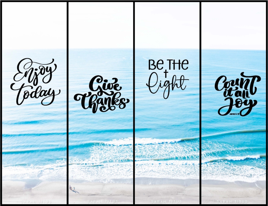
If you love the ocean, be sure to download some Christian ocean wallpapers for all your tech and social media here too! You can find several different designs below:
Reading to grab your bookmarks?
You’ll get three different bookmark sets (12 bookmarks total):
Yes! Except for some large binders, all printables on the blog are 100% free for personal use. I make these because I genuinely want you to have something cute and helpful right now without having to spend a dime. You deserve a life that feels more peaceful, more organized, and more you, and if a simple printable can make your day feel lighter, I am so happy to give that to you.
Can I use these printables for my classroom or church group?
Absolutely! You’re welcome to print as many copies as you need for your own students or church groups. I only ask that you do not edit them in any way (leaving the full copyright line in tact) or sell them or host the digital files on other websites. Please always link back to this post to share with others.
What is the best way to print these high-quality printables?
For best results, I recommend printing on 8.5″x11″ white paper. These are professionally designed as high-resolution PDFs so they will stay crisp and clear, making them perfect for any printer.
The Galaxy S26 series is expected to feature built-in magnets for native MagSafe accessory compatibility.
A new “Magnet Wireless Charger” (EP-P2900) has been spotted, and it could support up to 25W charging for the Ultra and 20W for the other S26 models.
Older devices like the Galaxy S25 and Z Fold 7 will also work with this charger, though at reduced 15W speeds.
The Samsung Galaxy S26 series is expected to launch next month, and one of the key upgrades across the lineup is expected to be the presence of Qi2 magnets built into the phones themselves. This would allow the Galaxy S26 series to be immediately compatible with a wide range of MagSafe accessories. Samsung plans to launch its own magnet accessories, too. Samsung’s upcoming magnetic wireless charging power bank has been spotted before, and now Samsung’s upcoming magnetic wireless charger has been spotted as well.
Don’t want to miss the best from Android Authority?
Sammobile has obtained images of Samsung’s upcoming Qi2 25W charger for the Galaxy S26 series. Called the Magnet Wireless Charger, model EP-P2900BBEGWW, this charger is expected to provide up to 25W of wireless charging to the Galaxy S26 Ultra. The Galaxy S26 and Galaxy S26 Plus could be limited to 20W wireless charging, based on previous leaks.
Older Galaxy phones with Qi2 certification, such as the Galaxy S25 and Galaxy Z Fold 7, are also said to be compatible with this charger. However, these could be limited to a maximum of 15W.
The charger features a USB-C port on one end, and the cable appears to be braided, which is good for durability. The report states that Samsung recommends pairing this 25W wireless charging puck with a 45W USB PD charger.
We’ll have to wait for Samsung to officially announce the product to know pricing and availability details. Samsung recommends using official accessories to charge its phones, so this charger could be a top choice for wirelessly charging the Galaxy S26 series.
Thank you for being part of our community. Read our Comment Policy before posting.
In the 1970s, disco music became a cultural and fashion phenomenon with clubs, disco balls, and John Travolta’s iconic dance moves in Saturday Night Fever. What does this have to do with AutoCAD you may ask? Well, have you ever dragged your mouse across a drawing, and the objects below it lit up like you’re in a disco? Rolling over text, hatches, tables, and groups may light up like it’s to a dance beat, too.
Perhaps you’re a bit like me, and while you can appreciate the visual stimulus, you’d rather just get to the point. Today, our feature is called Selection Preview, and, like many AutoCAD features, you can control how it works.
Selection Preview Settings
The first step, of course, is getting there. It starts with the Options dialog. Get there in your favorite manner – mine is to right-click anywhere in the drawing editor (with no objects selected) and select Options from the pop-up dialog.
Then, in the Options dialog, click on the Select tab as shown in the image above. Finally, you’ll want to focus on the Preview settings in the bottom right.
Now that you’re where you need to be, let’s see what some of our options are.
The first two are directly responsible for our rollover scenario, and one is part of the things I always change when I get an upgrade. We can immediately stop the disco lights when rolling over things with no command active. Uncheck the second entry. That alone will be a big change for you. Personally, I like to have only selection preview enabled when I have a command active.
You can also control what kinds of objects are lit up like a disco dance floor when they are previewed. Click on the Visual Effect Settings… button, and you’ll get the following dialog.
We want to focus our attention on the right side. This is one of the more unusual dialogs in AutoCAD, as you are selecting an object type to exclude, instead of one to include. Of course, those unchecked are included, but I think you get my meaning. By default, objects on locked layers and Xrefs are excluded from preview. If you’d prefer to see them previewed, uncheck them here. Back to our scenario, this is where you can tell AutoCAD not to preview Tables, Groups, Mtext, or Hatches.
Again, you’re excluding things here, so, for example, if you never want to see Hatches preview, whether you’re in a command or not, check it here. Click OK to save and exit, and do the same for the main Options dialog.
Moving Forward
One of my favorite non-disco bands of that era led a song with the lyrics “Don’t look now, but here come the 80’s.” Not exactly a good way to make a song timeless, but hey, at least I remember it 45 years later.
By that time, though, the disco age was coming to a close, culminating in a 1979 “Disco Demolition Night” event at a Chicago White Sox home double-header, which quickly devolved into a riot of fans burning disco records.
The good news for you is that you can keep AutoCAD from looking like a disco dance floor and more like a streamlined, fast CAD program. It’s just a matter of knowing where to go and what to adjust.
When you do, those polyester suits, gold chains, and slicked back hair will stay in the disco era where they belong.
More Tuesday Tips
Check out our whole Tuesday Tips series for ideas on how to make AutoCAD work for you.